Tableau introduced the R integration in version 8.1 back in 2013. That’s awesome because it opens up to Tableau the whole range of analytical functionality R offers. Most of the time the R code being triggered from within Tableau is rather short, such as a regression, a call to a clustering algorithm or correlation measures. But what happens when the code you want to run out of Tableau is getting longer and more complicated? Are you still bound to the “Calculated Field” dialog window in Tableau? It’s nice but it’s tiny and has no syntax coloring or code completion for our precious R code.
Run R code inline in a Calculated Field in Tableau
Im letzten Quartal 2016 haben wir als würdigen Nachfolger der Tableau Stadion Tour 2015/16 die Tableau Kino Tour 2016/17 aus der Taufe gehoben. Nach vier bisher sehr erfolgreichen Stationen (Frankfurt, Hamburg, Berlin und Düsseldorf) warten jetzt im zweiten Teil der Tour in 2017 noch Wien, München, Zürich und Stuttgart auf uns. Da immer wieder die Frage nach den Daten kam, die hinter der Kino Tour stecken, und auch weil es tatsächlich ein sehr interessantes und spaßiges Projekt war, diese Daten zu generieren, habe ich im Folgenden mal die einzelnen Schritte zusammengefasst, vom Download der Quelldaten bis zum fertigen Produkt. Aus Copyright-Gründen dürfen wir die fertigen Daten leider nicht einfach so zum Download anbieten, aber mit der Schritt-für-Schritt-Anleitung sollte es nicht allzu schwierig sein, das zuhause selbst nachzustellen.
Makeover Monday is a great project started by Tableau‘s very own Andy Cotgreave (@acotgreave) and Andy Kriebel (@VizWiz) from Tableau partner The Information Lab. They started it off last year, won an award in the meantime, and Andy Kriebel and Eva Murray (@TriMyData, Tableau Evangelist at EXASOL) decided to continue running the project in 2017 as well. It’s great because it makes people look at data visualizations more critically, try out what works and doesn’t work in data viz themselves, and get discussions started. All that in a very productive and friendly way. Also, people practice working with Tableau. So it’s a win-win-win situation!
How does it work? Andy and Eva publish a a visualization with an interesting story (and the accompanying data set) every week on Sunday. There’s not hard rules per se, but you shouldn’t add any ancillary data and work just with the original data set, you shouldn’t invest hours but instead try to limit yourself to roughly one hour of work, and you should publish the fruits of your work on Twitter using the hashtag #makeovermonday. You can read more about the details on the project website.
I always wanted to participate in Makeover Monday myself but that never materialized. Tonight I felt like finally doing it and actually spent about half an hour with my very first submission. I’m not too proud of it but think it’s OK-ish…
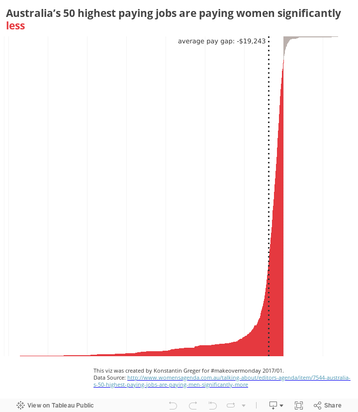
This week’s topic was the massive differences between the income of men and women doing the exact same jobs. This is a global issue but the data was from Australia. I tried out a few things but knew from the beginning I wanted to focus on the actual pay gap – a figure that wasn’t in the original data set. Luckily calculations like this are very easily done in Tableau. As for the color scheme I used the main color used by the source website and some neutral grey. It’s not much, but sometimes less is more, right? In the end the viz doesn’t seem to provide detailed data about different occupations but instead only shows the major negative bias in terms of income differences between men and women. But there’s some interactivity! Just hover over the chart to see the actual detailed data and income values for all the occupations.
Tableau Desktop has a great (undocumented) feature that allows you to automatically taking screenshots of your worksheets whenever they are rendered. It’s no rocket science but you should be careful when activating this mode (performance decrease, anyone?!) and understand fully what you’re doing when following the instructions here. And don’t forget to reset to normal mode when you’re done! This mode is especially interesting when it documents the process of finding the right way to tell the stories hidden in data sets like the ones used for Makeover Monday. Here’s mine for this week’s exercise:
Advanced Logging for Makeover Monday 2017/01
Overall I’m OK with the result, I’m happy with the dataviz exercise, and I’m conviced this will not be my last Makeover Monday submission!
With my background of spatial terrorism analysis I’m always very interested in the statistical analysis of crime data. Scott Stoltzman over at stoltzmaniac.com discovered a great data set by the City and County of Denver. It has data about all the criminal offenses in the City and County of Denver for the previous five calendar years plus the current year to date with plenty of attributes, timestamps and even geographic locations. Scott wrote a series of blog posts (starting here, then here, and here) showing some initial exploratory data analysis (ETA) in R and also some in-depth looks into a few topics that sparked his interest along the way. That’s exactly what Tableau wants to enable people to do, so with this first episode of “Let me tableau this for you” I want to show how easy it is to get to the same interesting insights Scott outlined in his write-up, only without all the coding. I’m not sure how long it took him to get from finding the data to generating all the plots in the article, but my guess would be it took longer than this ~20 minute screencast. Enjoy the video below, and please let us know in the comments section if you have anything to add. Please refer to the original post if you want to know more about the idea behind Let me tableau this for you (LMTTFY).
Just like “to google” has become habitual language use since Google as a search engine became available, we see more and more people using Tableau in a similar manner: “to tableau” as a synonym for “to visualize data”.
to tableau
While, admittedly, this doesn’t translate well into my day-to-day locale of German it sparked an idea.