When trying to fit a machine learning model on a very wide data set, i.e. a data set with a large number of variables or features, it is advisable for a number of reasons to try to reduce the number of features:
- The models become easier understandable, and their output as a result better interpretable, which leads ultimately to results that can be trusted rather than those of a complex black box model.
- The exclusion of strongly correlated features can prevent model bias, as the effect of multiple variables could otherwise gain greater influence on the model as they actually do.
- Similarly, it can help to avoid the curse of dimensionality, in the case of very sparse data.
- Ultimately, the performance of the model can be optimized, as training times are shorter and the models are less computationally intensive.
While developing my talk “Machine Learning, Explainable AI, and Tableau”, that I presented together with Richard Tibbets at Tableau Conference in November 2019 in Las Vegas, I wrote a number of R scripts to perform feature selection and its preliminary tasks in Tableau. Due to the large number of questions I received about those scripts after the presentation, I decided to put together this article explaining what precisely I did there, in an attempt to make the “Tableau Feature Importance Toolbox” – as I’m calling the collection of scripts – available to the interested public. At a later point I will also summarize the contents of our talk in an article here on the blog, but for now you can find details about the scripts in the following, as well as the actual code files on my GitHub repository.
The topic of our talk was a lot broader and focused on the fundamental issue of how, under which circumstances, and why we can or should trust the results some AI spit out based on its underlying machine learning algorithms. There is a number of advanced techniques and tools for doing real Explainable AI – in the talk we mentioned LIME, but there are many more. But we don’t even have to go that deep to gain a first understanding of what’s happening in our data, and also to understand what factors are driving the outcome we’re interested in. For that reason – and also because it’s a logical starting point that can be explained and demoed within the constrained time frame of a Tableau Conference session – I decided to focus on three topics in this first iteration:
- A correlation matrix to identify correlated features within our data,
- the measurement and ranking of the importance of all features,
- and a way to limit the complexity of the data set by selecting only the most important features.
All three methods have been implemented in R and are run as part of a Tableau Prep flow, as shown below. So before diving into the scripts themselves, let me briefly touch on how to run R scripts (or Python, for that matter) from Tableau Prep. If you already know how to do that, feel free to skip this next section.

External Services in Tableau Prep
While this has been possible with Tableau Desktop for quite a while now (R since version 8.1, Python since version 10.1) Tableau introduced the external services connection in Tableau Prep with version 2019.3. This opens up lots of possibilities that were hitherto either impossible or just impractical to do. My favorite example is that of sentiment analysis of text (e.g. tweets). Sure, you could load them into Tableau Desktop and run a sentiment analysis script in a Calculated Field, but think about it: does it really make sense to recalculate that every time somebody interacts with your viz? Unless any parameters of your scoring algorithm have changed, the same text will always result in exactly the same sentiment value. Use cases like this lend themselves to be moved further up in the processing pipeline, into the ETL step – in Tableau terms that means Tableau Prep. You load your data, maybe join, union, preprocess, and clean it, then calculate your sentiment score and move that data to where it’s supposed to live. This is a valid consideration for all calculations that don’t rely on the level of aggregation of the data on the viz or external input such as model parameters that can be modified by the user at run time. In the use cases shown here this is true for 2.5 of the three – you’ll see what I mean by that towards the end of the article.
But let’s quickly look at how we can make Tableau Prep run external scripts. The process is a bit different from what you might be used to from Tableau Desktop. In Prep Builder, external scripts are not run as part of Calculated Fields (so no more SCRIPT_*() functions), but have their own step type: it’s aptly called Script:
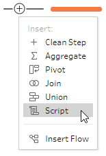

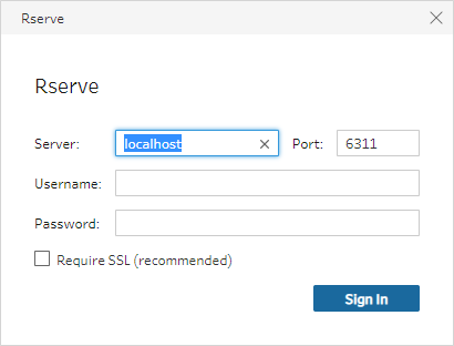
The interface of the Script step is made up of three areas: the configuration pane on the left, the outcome preview pane on the right, and the outcome data grid at the bottom. The configuration pane allows you to switch between RServe and TabPy, to establish the connection to either RServe or TabPy, select the file containing your R/Python code, and finally a reference to a function within this code file that should be run in the context of this specific Script step.
Here’s a (non-working) snippet of what the content of such a code file should look like:
myFunction <- function(df) {
	# your R code goes here
	# use the data frame df

	# return result
	return(result)
}

getOutputSchema <- function() {
	return(data.frame(
		x = prep_string(),
		y = prep_decimal())
	);
}
As you can see, there are two main components here, implemented as R functions. The first one myFunction() is, well, your custom function. This is where the magic happens, and what’s inside of this function, as well as its name, are completely up to you. All the data that’s flowing into this Script step will end up in R as a data frame – I called if df, but that’s also up to you -, where the fields can be referenced by their names as it appears in Tableau Prep. We’ll see that in the actual examples below. This is also the function you reference in the configuration pane of your Script step.
The second one getOutputSchema() is a bit more restricted in what you can or rather have to do there. This function defines what data will flow out of this Script step for other steps to work on it. Both the name getOutputSchema() and the structure of this function have to follow the schema shown above. As you can see, we’re building up another R data frame and have to explicitly declare all output fields. They need a name (here x and y) as well as data types. There are a total of six self-explanatory data types: prep_string(), prep_decimal(), prep_int(), prep_bool(), prep_date(), and prep_datetime(). For more information have a look at the official documentation. Make sure to define them correctly, otherwise Tableau Prep will choke with a corresponding error. The order and types have to match the structure of the data frame your custom function returns (see above).
For completeness: the process for Python scripts is very similar, only we’re dealing with pandas data frames. A full documentation can be found here.
Correlation Matrix
Now that you know how to do it, let’s have a look at what we actually set out to do. The purpose of a correlation matrix, as the name implies, is to show the relationships between the variables, whether it’s positive (“the more of  , the more of
  “) or negative (“the more of , the less of “) and also the degree of the relationship. The reason we want to do this is one of the prerequisites for doing a proper feature importance analysis later on, the elimination of correlated features to avoid model bias. I’m not going too deep into detail about the statistical background and assumptions here, but feel free to read up about it – the Wikipedia article is surprisingly good.
Here I went for the simplest possible measurement of correlation, Pearson’s product-moment correlation coefficient, which strictly makes this correlation matrix a covariance matrix. You can see how this calculation fulfills the aforementioned prerequisite for including it into the data preparation pipeline, as these correlation coefficients won’t change unless the data changes (at least as long as we assume that all the data is considered and we’re not filtering certain rows). Another good reason is the fact that the shape of the output data differs wildly from that of the input data. Think about it: we might start with a data set of 1,000 features and three measures whose correlation we want to calculate (i.e. a  matrix), but the result will be comparing all three measures with all three measures (i.e. a
  matrix). Things like this can be done in Tableau Desktop as well, but involve a fair bit of computational magic, plus the expensive calculations will always return the same numbers, anyways.
Let’s have a look at the R code I put together for this example, this is the custom function in a file I called correlationMatrix.R (remember that all the files are available for download from my GitHub repository):
correlationMatrix <- function(df) {
	# ensure the results are repeatable
	set.seed(2811)

	# load the libraries
	library(dplyr)
	library(corrr)

	# rearrange data frame
	df <- df %>%
		select(id, outcome, everything())

	# calculate correlation matrix
	cm <- correlate(df[, 3:ncol(df)],
		            use = "pairwise.complete.obs",
		            method = "pearson",
		            diagonal = 1)

	# transform to long format
	cm <- stretch(cm)

	# return result
	return(cm)
}
I’m using some functions of the tidyverse here, base R aficionados can surely rewrite the code to their pleasure. One thing to note is that I tried to keep the code as reusable as possible, so I refrained from hard-coding too much into the functions. That said, the functions (not just this one but all three introduced in this article) expect data in a bespoke format. I even pointed this out in the example flow (also downloadable from GitHub) in the comment to the first (otherwise unnecessary) Clean step: “Make sure to rename the identifier column to ‘id’ and the outcome variable to ‘outcome’. All other columns will be treated as features.” You can spot these two column identifiers in the function above, maybe you want to go for an even more portable approach and address the identifier column and output variable by their column indices instead of their names. Feel free to go crazy and make sure to share the results!
The data I’m using here for this example is the Breast Cancer Wisconsin (Diagnostic) Data Set by the excellent UCI Machine Learning Repository. I obtained the raw data files from Kaggle.
Back to our script. It rearranges the data frame df in such a way that the id and outcome variables come first, followed by the remainder of the columns in the order they were handed over. I’m then using the correlate() function of the corrr package, as in my opinion it is the cleanest and most intuitively usable implementation of calculating a correlation matrix. Again, feel free to use whatever calculation you prefer.
Finally, since this is the format Tableau can visualize the data the easiest, I’m transforming the data from the wide format correlate() produces (an  data frame, where n is the number of variables) into a long table (an
  data frame). The
 return() on the last line will hand over this data frame to the getOutputSchema() function, which looks like this:
getOutputSchema <- function() {
	return(data.frame(
		x = prep_string(),
		y = prep_string(),
		r = prep_decimal())
	);
}
It adapts to the structure of the data frame our custom function correlationMatrix() produced and defines three variables to be handed back over to the Prep flow: two strings x and y, which contain the variable names, and a decimal number r, which contains the Pearson product-moment correlation coefficient of the two variables – traditionally labeled as r.
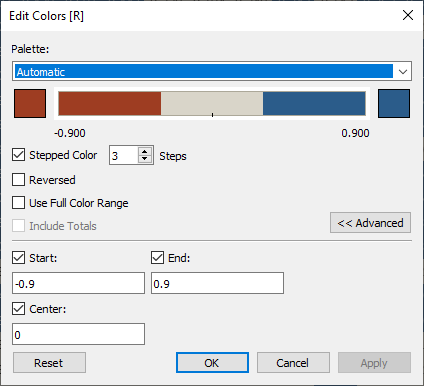
And that’s it! This newly shaped data frame can then be exported to a CSV or Hyper extract, or published directly to Tableau Server. Visualizing this data is as simple as loading the data in a Tableau worksheet, building a cross table of [x] and [y], with [r] on Color and Label, and presto (the workbook is also downloadable):

I then slightly modified the color legend to make the strongly correlated features more easily visible:
Feature Importance
Next up is the actual importance of the features, that is how much impact do changes in each of the features (that is, variables) have on the outcome variable. Just like in the previous example, there are myriads of ways to calculate feature importance, be it in the form of various algorithms but also their implementation in R packages. Here, I decided to use learning vector quantization (LVQ) as implemented in the caret package.
featureImportance <- function(df) {
	# ensure the results are repeatable
	set.seed(2811)

	# load the libraries
	library(dplyr)
	library(caret)

	# rearrange data frame
	df <- df %>%
		select(id, outcome, everything())
	df$outcome <- as.factor(df$outcome)

	# calculate feature importance (Learning Vector Quantization)
	control <- trainControl(method = "repeatedcv",
		                    number = 10,
		                    repeats = 3,
		                    verboseIter = TRUE)
	model <- train(outcome ~ .,
		           data = df[, 2:ncol(df)],
		           method = "lvq",
		           preProcess = "scale",
		           trControl = control)

	importance <- varImp(model,
		                 scale = FALSE)

	fi <- as.data.frame(importance$importance)
	fi <- cbind(Variable = row.names(fi), fi) %>%
		select(Variable, B, M)

	# return result
	return(fi)
}


getOutputSchema <- function() {
	return(data.frame(
		Variable = prep_string(),
		B = prep_decimal(),
		M = prep_decimal())
	);
}
The rearrangement of the data follows the guidelines mentioned above, only this time we have to make sure the outcome variable is a factor, as that’s what the upcoming functions expect it to be. I defined the model to be trained on a ten-fold cross-validation which is repeated three times, then scaled and used to model the outcome variable based on all other features. I also made the training process verbose, because who doesn’t love text appearing on a console window… Feel free to change any of those parameters around to your liking. In the end I’m building a data frame that consists only of the variable names and two columns for the importance of each variable towards the two possible values of the outcome variable. This data frame is then sent back to the Tableau Prep flow via the getOutputSchema() function, as discussed earlier.
Full disclosure: Here I decided to take the easy approach and hard-coded the number of possible outcomes (two) as well as their labels (“B” for benign and “M” for malignant) into the function. With regards to reusability this should be made dynamic. Since we have to define the structure of the output data frame inside our getOutputSchema() function, this can’t really be decided dynamically. You could make it part of your API to use only (up to) two outcomes, or you could make this number arbitrarily higher (say, up to ten), fill the columns not needed with NULLs (NAs in R terminology) and filter these out later in your data flow in Tableau Prep. Applying dynamic column names would work in either scenario.
The simplest visualization that can be built on top of this data is a simple feature importance race:
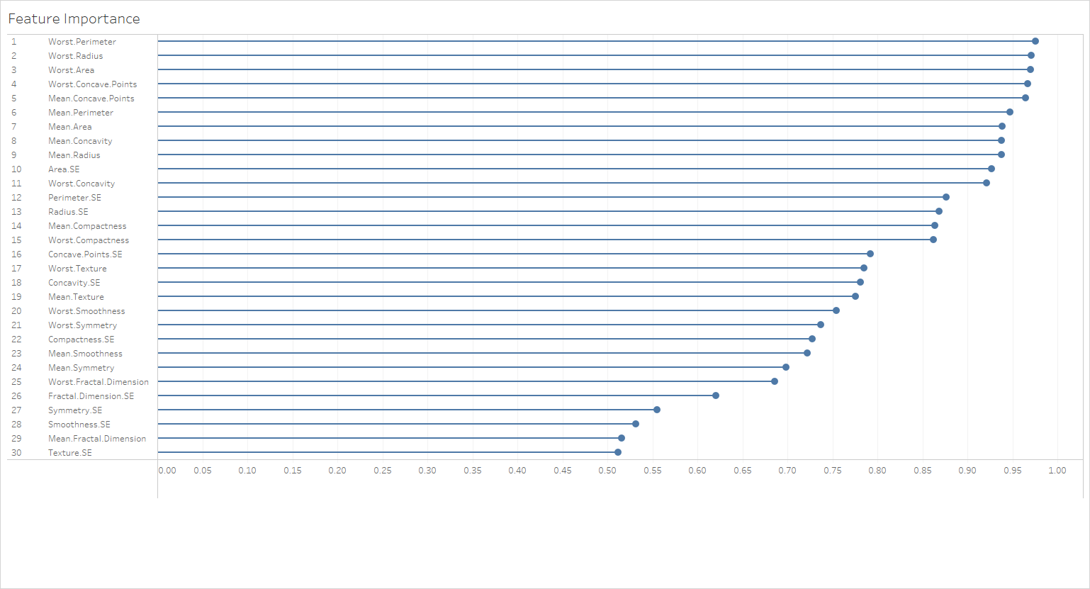
You could use a Reference Line (maybe based on a Parameter?) to show features above a certain importance threshold. Get creative!
Feature Selection
Now for the grand finale: we want to build a model that reduces the number of features in a very wide data set to only features selected based on their importance towards a defined outcome variable. Here, I decided to use recursive feature elimination (RFE) – for no other reason than to show that practically any model can be leveraged in this external service connection scenarios. RFE starts by looking a the complete data set and then removing features from it while monitoring how well the outcome can still be explained. By doing so it is not only able to identify the most important features, but also to decide how many features should be retained for optimal explainability. Quite neat! If you want to know more about how it does that, I highly recommend the corresponding section of the caret package help.
selectImportantFeatures <- function(df) {
	# ensure the results are repeatable
	set.seed(2811)

	# load the libraries
	library(dplyr)
	library(caret)

	# rearrange data frame
	df <- df %>%
		select(id, outcome, everything())
	df$outcome <- as.factor(df$outcome)

	# backwards feature selection (Recursive Feature Elimination)
	control <- rfeControl(functions = rfFuncs,
		                  method = "cv",
		                  number = 10,
		                  verbose = TRUE)

	results <- rfe(df[, 2:ncol(df)],
		           df[, 1],
		           rfeControl = control)

	print(results)
	iv <- as.data.frame(cbind(importantVariable = predictors(results)))

	# return result
	return(iv)
}


getOutputSchema <- function() {
	return(data.frame(
		importantVariable = prep_string())
	);
}
The remainder of the custom function selectImportantFeatures() is pretty much boiler plate from what we’ve seen in the previous two examples. It’s worth noting, though, what kind of result we are returning to the Tableau Prep flow, and how this helps us to actually narrow down the data set for further analysis in Tableau Desktop. If you look closely at the code, you can see that I’m only returning a vector with the names of the features that should be kept. Luckily for Tableau Prep it doesn’t matter how long this vector is (since we simply don’t know before the model is finished) – remember that this would be an issue in Tableau Desktop, as the input and output vectors have to be the same length when dealing with SCRIPT_*() functions. The rest of the magic is happening outside the R script and back in Tableau Prep:
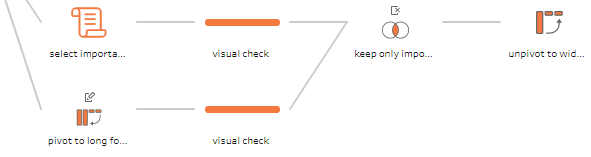
The top branch of the orange sub-flow is the script we just discussed, the bottom branch (both originate in the source data) pivots the wide data, essentially an  matrix, where
  is the number of features (plus unique identifier and outcome variable), and
  is the number of rows, to a long shape, an
  matrix:
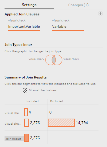
Since the output of our feature selection script is one column with one row per selected feature name, we can easily inner join these two tables on the respective variable name columns to limit the original data to only those rows that represent the selected features:
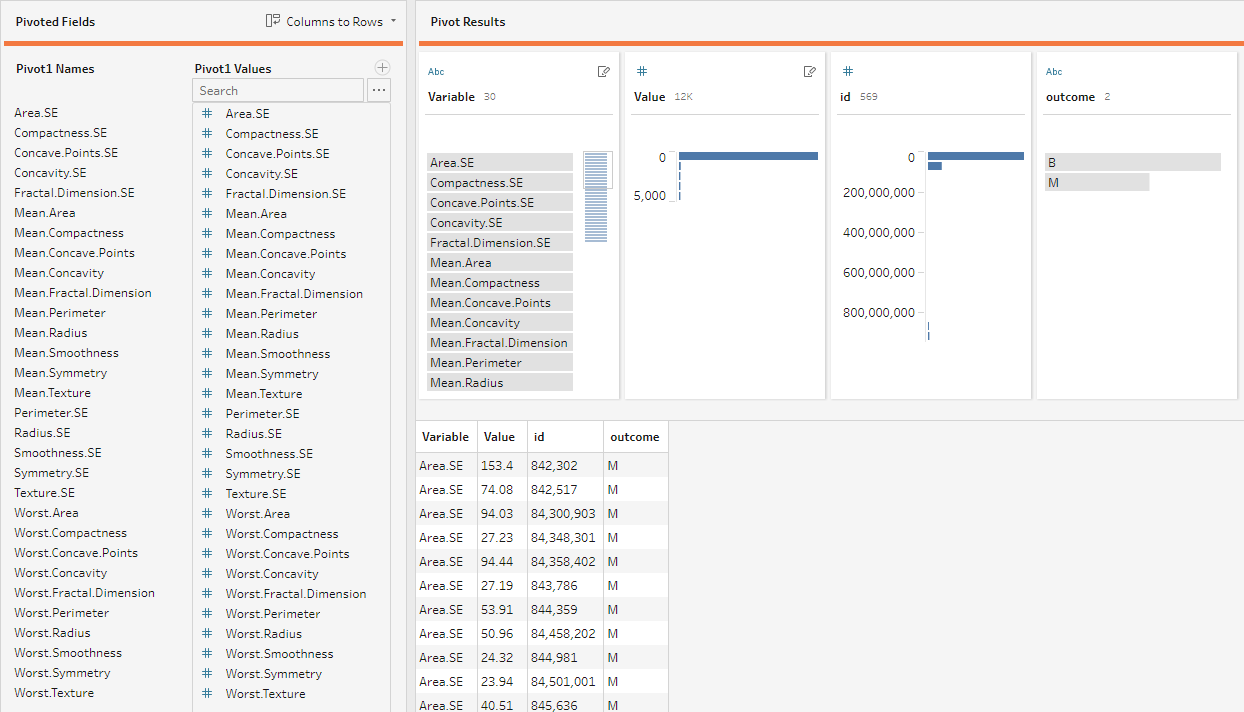
Finally, we need to unpivot our long format data to its original wide format (unless your analysis is built on long format data, that is!), which we can do easily in Tableau Prep Builder since the unpivot feature was released in version 2019.1.1. Just select a Pivot step and make sure to set the mode to “Rows to Columns” in the top-right of the pivot’s configuration pane. Then drag the field “Variable” (unless you renamed it in the previous step) to “Pivoted Fields” and let Tableau Prep Builder work its magic.

Done! Now what can we do with that data? In reality, you would probably do all your upcoming analyses on this reduced feature set only. Remember the four reasons I started this article with for why we’re doing this in the first place! Here, since this is just a toy example, I wanted to see how much of an impact the reduction of the features has on the predictability of my data. So I built a dashboard in Tableau Desktop that calculates a Random Forest predictor trained on 70% of the data and then tries to predict the remaining 30%. The two sheets compare the results of that prediction for the full data set (on the top) and the reduced data set as per the RFE feature selection we performed earlier (on the bottom). I also calculated the out-of-bag error term (OOB) to evaluate how good or bad the model(s) are:
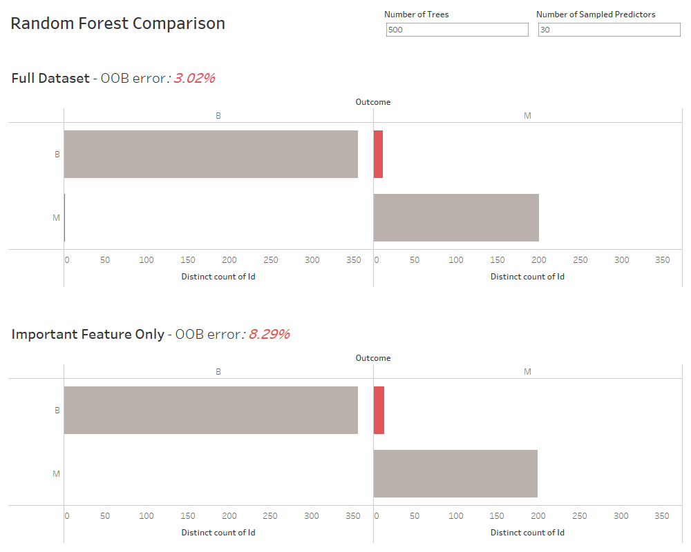
Note how the prediction is only slightly worse for the reduced set of four features versus the full 30 features in the original data. Here I’m not going into how I did this random forest classification, but feel free to have a look into the worksheets and the respective Calculated Fields – remember that all content is up on my GitHub repository. Meet our good old friends, the SCRIPT*_() functions there! Of course the whole dashboard is interactive, so you can use the two parameters at the top to fine-tune the random forest classifier.
Summary
The purposes of this article are manifold: I wanted to provide a good, almost-real-world example of using the external services integration in Tableau Prep; I also wanted to make the most of the practical examples I prepared for the Tableau Conference talk – it would be rather wasteful to use them only this one time; last but not least, I wanted to provide a ready-made and hopefully reusable implementation for feature selection (incl. calculation of a correlation matrix and feature importance). I sincerely hope the article was able to deliver at least one of these to you – if so, I’d be happy to know. Also, if you have any corrections, improvements, or opinions on the content, please don’t hesitate to contact me in the comments. And don’t forget that all the files (the R code, the source data, the Tableau Prep flow, and the workbook) are waiting for you to download from my GitHub repository.