Imagine you have Tableau dashboards that require the use of row-level security on data coming from PostgreSQL, but the connection to that database is established through the same technical user for everyone. How can you achieve that? Is it even possible? Short answer: it’s possible – and it’s not even that complicated, provided you’re not afraid of some PL/pgSQL scripting, PostgreSQL session IDs, and clicking on that mysterious “Initial SQL” button in Tableau Desktop. For full disclosure I’d like to mention that I found the original idea for this approach on my colleague Bryant Howell’s excellent blog, where he outlines the process for Microsoft SQL Server. That said, the approach I’m showing here is not a mere translation from SQL Server to PostgreSQL, but I also added a few more features.
Continue reading →Category / How To
Feature Selection in Tableau
When trying to fit a machine learning model on a very wide data set, i.e. a data set with a large number of variables or features, it is advisable for a number of reasons to try to reduce the number of features:
- The models become easier understandable, and their output as a result better interpretable, which leads ultimately to results that can be trusted rather than those of a complex black box model.
- The exclusion of strongly correlated features can prevent model bias, as the effect of multiple variables could otherwise gain greater influence on the model as they actually do.
- Similarly, it can help to avoid the curse of dimensionality, in the case of very sparse data.
- Ultimately, the performance of the model can be optimized, as training times are shorter and the models are less computationally intensive.
While developing my talk “Machine Learning, Explainable AI, and Tableau”, that I presented together with Richard Tibbets at Tableau Conference in November 2019 in Las Vegas, I wrote a number of R scripts to perform feature selection and its preliminary tasks in Tableau. Due to the large number of questions I received about those scripts after the presentation, I decided to put together this article explaining what precisely I did there, in an attempt to make the “Tableau Feature Importance Toolbox” – as I’m calling the collection of scripts – available to the interested public. At a later point I will also summarize the contents of our talk in an article here on the blog, but for now you can find details about the scripts in the following, as well as the actual code files on my GitHub repository.
Continue reading →Why Decide? Using Both R and Python in Tableau – at the Same Time!
With the integration of external services such as R, Python, and MatLab into Tableau you can significantly broaden the circle of possible users for your organization’s data science models and workflows, by embedding them into easy-to-use dashboards that are appealing to all types of consumers. That said, if you have ever worked with the integration of external services in Tableau, you will be aware that you can only define one service connection per workbook at a time – either to RServe or to TabPy. The first time this fact became painfully apparent to me was during a workshop where I was showing the integration with both services. Every single time I switched from a worksheet that employed some R code to one embedding Python code, I had to set the connection to RServe. Whenever I moved back over to another worksheet with some embedded Python code, I first ran into an error (since Tableau sent the Python code to RServe, which obviously made the R session choke) and then had to manually reset the connection to TabPy. The same was true for the session “R … You Ready for Python?” me and my colleague Lennart Heuckendorf delivered at Tableau Conference Europe 2018 and 2019. Even worse, I am more and more working with customers whose data science stack is very diverse, so they are using models in all kinds of languages. For them it is imperative to be able to run both R and Python models within the same dashboard, possibly even on one single worksheet. So I was wondering: can this be done?
tl;dr: It’s absolutely possible! This article outlines the process we suggest and guides you from zero to a working environment to do exactly this. It builds heavily on an idea proposed by my colleague Timo Tautenhahn and one of his customers here and here, so I can’t take all the credit. It also makes use of a number of external and open source software packages, so this is neither officially supported by Tableau (don’t try logging a ticket with Technical Support if this doesn’t work for you) nor is this an official Tableau tutorial. If all these caveats didn’t discourage you to try it out yourself, read on! All the code required or referenced here is available on my GitHub repository. Also, you’ll find a video at the end of this blog post to walk you through the full process.
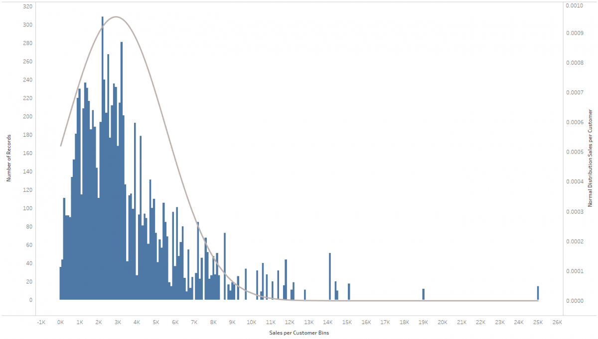
Continue reading →Jingle Bells – Adding a Normal Distribution to a Histogram in Tableau
It’s the holiday season, so why not amp you your vizzes’ holiday spirit by adding some bell curves to your histograms? Also, I just recently came across this request in a customer meeting and thereby discovered how easy that is to do. The most difficult part is wrapping your head around what a normal distribution is (please resort to Wikipedia for that), how it’s calculated (I literally stole the equation from Wikipedia) and how to translate that into a Calculated Field in Tableau. The rest is a simple dual-axis chart, a parameter and some rather basic Tableau techniques that need your attention.
Embedding R Plots in Tableau Dashboards
“R you nuts?” is what my colleague asked me when I once proposed this little hack. He’s not completely wrong, we’ll get to that later…
The task I was presented with was to embed the graphical output from an R package in a Tableau dashboard. Of course it’s possible to run R code from within Tableau Calculated fields, you can read more about it in official Tableau resources here, here, and here and also here on my blog. But part of the game is that there is only one vector of data being returned from the R session via Rserve into a Table Calculation in Tableau. So what about some of the complex graphics R can produce? Sure, you can try to rebuild those natively in Tableau based on the data returned from the code. But what if a) you’re too lazy to do that (and also it’s all just about rapid prototyping something anyways), or b) the visualization is just too complex (think 3D brain models)?