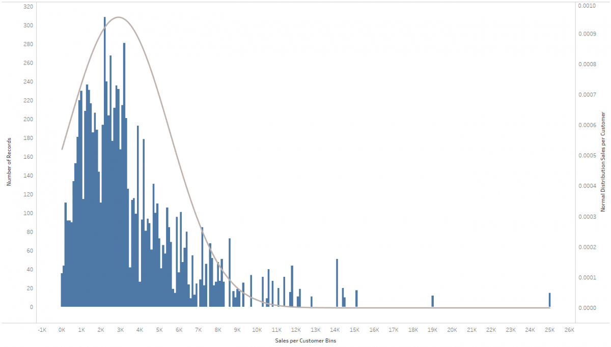
It’s the holiday season, so why not amp you your vizzes’ holiday spirit by adding some bell curves to your histograms? Also, I just recently came across this request in a customer meeting and thereby discovered how easy that is to do. The most difficult part is wrapping your head around what a normal distribution is (please resort to Wikipedia for that), how it’s calculated (I literally stole the equation from Wikipedia) and how to translate that into a Calculated Field in Tableau. The rest is a simple dual-axis chart, a parameter and some rather basic Tableau techniques that need your attention.