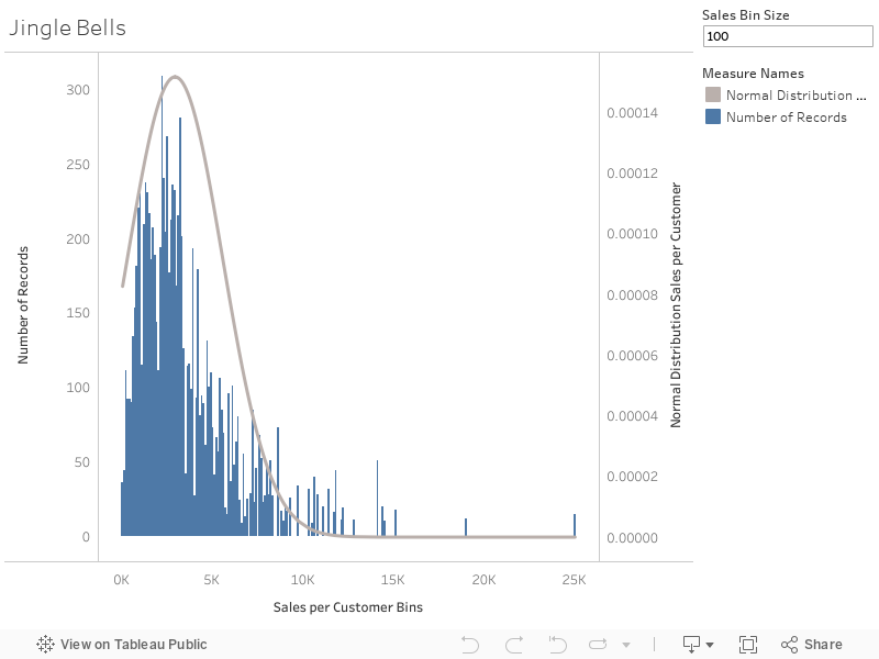
It’s the holiday season, so why not amp you your vizzes’ holiday spirit by adding some bell curves to your histograms? Also, I just recently came across this request in a customer meeting and thereby discovered how easy that is to do. The most difficult part is wrapping your head around what a normal distribution is (please resort to Wikipedia for that), how it’s calculated (I literally stole the equation from Wikipedia) and how to translate that into a Calculated Field in Tableau. The rest is a simple dual-axis chart, a parameter and some rather basic Tableau techniques that need your attention.
I have uploaded the workbook to Tableau Public for your reference (also embedded at the end of this article), but feel free to try it out yourself, either on the Super Store data like I did or even on your own distributions.
Step 1: Bin your Data
I decided to use the [Sales] numbers, but you can create distributions on any measure – possibly even build a parameter to allow your users to choose from the available measures themselves. As the regular Super Store data contains sales figures for multiple orders (and line items) per customer, we first calculate the total sales per customer:
{ FIXED [Customer Name]: SUM([Sales]) }
This is the measure we will refer to throughout this example. In order to build a histogram of a measure we need to create bins. I included a parameter [Bin Size] to allow for more interactivity – and also it looks really cool later on. While Tableau has a built-in binning option (just right-click any measure, then select Create > Bins…) we can’t use this here, as those automatic bins can’t be reused in Calculated Fields. That’s no big deal, though as we can use a very simple formula to manually create bins, even with a variable bin size:
FLOOR([Sales per Customer] / [Sales Bin Size]) * [Sales Bin Size]
Note that we should use FLOOR() or ROUND() here instead of INT(), as we need to make sure Tableau always rounds to the next smallest number, even for negative figures. That is, with a bin size of 100 positive 50 should be rounded to 0 while negative -50 should be rounded to -100. The small example below shows the differences between INT(), FLOOR(), CEILING(), and ROUND() on positive and negative numbers:

Different rounding functions in Tableau
Since the result of our calculation is another number, Tableau categorizes it as a measure. As we want to break down our sales by those bins, we need to make the bins a dimension – an easy drag & drop action or right-click and “Convert to Dimension”.
Step 2: Display your Histogram
This one is easy, as all we need to do is dragging out the newly created bin dimension onto Columns and the SUM([Number of Records]) onto Rows.
Step 3: Calculate the Normal Distribution
Now for the interesting part! As you just learned over at Wikipedia how to calculate the Normal Distribution – more precisely its density function – we simply need to translate this into the Tableau world. This is the formula:
![\[ f(x | \mu, \sigma^2) = \frac{1}{\sqrt{2\pi\sigma^2}} * e^{-\frac{(x-\mu)^2}{2\sigma^2}} \]](https://konstantingreger.net/wp-content/ql-cache/quicklatex.com-ae50a3d13509011b57b7cc2d2dc2ed73_l3.png "Rendered by QuickLaTeX.com")
Before we can tackle this beauty we should calculate the mean  and the standard deviation
  for our distribution. We could do this using a Table Calculation, but I prefer Level of Detail Expressions, so here we go:
{ AVG([Sales per Customer]) }
for the mean and then the standard deviation as
{ STDEV([Sales per Customer]) }
Once we have those down, we can go all in on the normal distribution:
(1
/
(MAX([StDev Sales per Customer]) * SQRT(2 * PI())))

*

EXP(-
POWER((MAX([Sales per Customer Bins]) - MAX([Average Sales per Customer])), 2)
/
(2 * POWER(MAX([StDev Sales per Customer]), 2)))
I went a little overboard on the parentheses, just to make it a bit more readable. Note that you have to aggregate our distribution mean and standard deviation inside of the calculation. The rest is just algebra and syntax. Finally we can drag this new measure onto the second axis of our plot, change the marks types the original histogram to bars and that of the normal distribution to a line, and we’re done!
Or are we? Look closely:
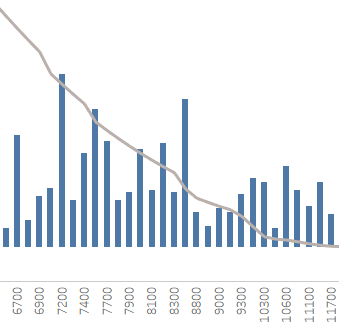
Small issue with the bell curve
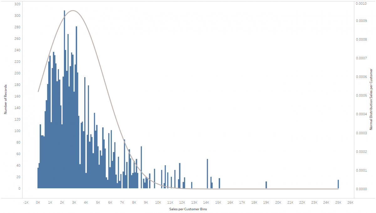
What are those creaks in the otherwise neat and smooth bell curve? A glance at the axis labels (technically it’s not even an axis, since it’s showing a dimension…) reveals the problem: In the tails of the distribution the differences between the otherwise evenly spaced labels vary! This is due to the fact that some bins are missing, as there are simply no records (in our case customers) falling within some of these bins. It tends to happen rather towards the tails of the distribution but could just as well happen anywhere along the range of the distribution. Had we used actual Tableau Bins we would have the option to “Show Missing Values” to remedy this, but as we’re using a plain old dimension now we don’t have that luxury. So we need to get a bit more creative: Make the bins’ dimension on the Columns Shelf continuous (e.g. by right-clicking and selecting “Continuous”). Only problem with this is that due to the varying bin size (as selected per our parameter) the bars of the histogram tend to overlap. Luckily this can also be easily fixed by assigning the parameter to the Size (i.e. width) of the bars:
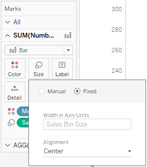
Setting the size of the histogram bars
As a result we get a neat dynamic histogram. Including the normal distribution in the background. Now you can go ahead interpreting the result! Happy holidays!