Makeover Monday is a great project started by Tableau‘s very own Andy Cotgreave (@acotgreave) and Andy Kriebel (@VizWiz) from Tableau partner The Information Lab. They started it off last year, won an award in the meantime, and Andy Kriebel and Eva Murray (@TriMyData, Tableau Evangelist at EXASOL) decided to continue running the project in 2017 as well. It’s great because it makes people look at data visualizations more critically, try out what works and doesn’t work in data viz themselves, and get discussions started. All that in a very productive and friendly way. Also, people practice working with Tableau. So it’s a win-win-win situation!
How does it work? Andy and Eva publish a a visualization with an interesting story (and the accompanying data set) every week on Sunday. There’s not hard rules per se, but you shouldn’t add any ancillary data and work just with the original data set, you shouldn’t invest hours but instead try to limit yourself to roughly one hour of work, and you should publish the fruits of your work on Twitter using the hashtag #makeovermonday. You can read more about the details on the project website.
I always wanted to participate in Makeover Monday myself but that never materialized. Tonight I felt like finally doing it and actually spent about half an hour with my very first submission. I’m not too proud of it but think it’s OK-ish…
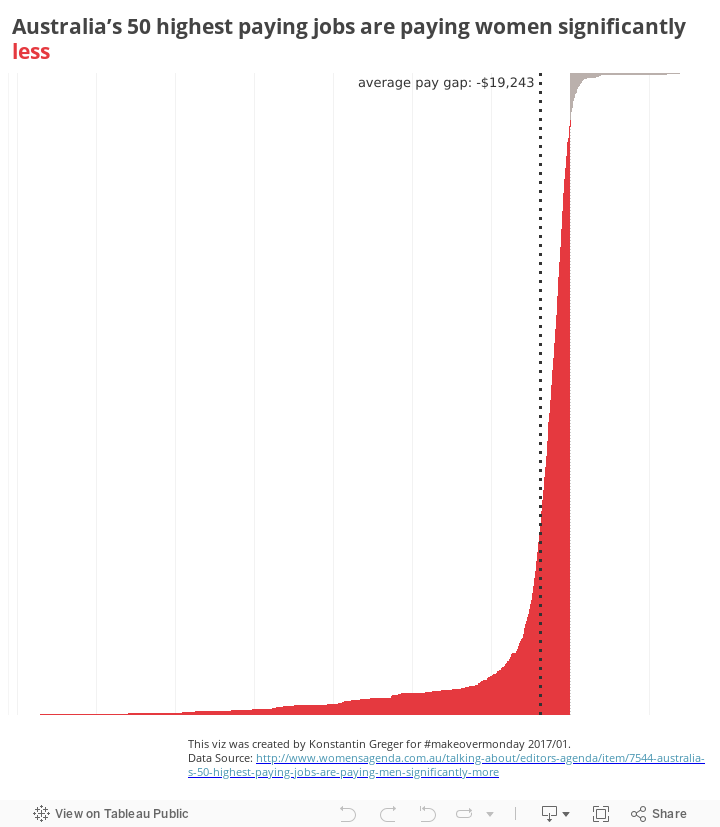
This week’s topic was the massive differences between the income of men and women doing the exact same jobs. This is a global issue but the data was from Australia. I tried out a few things but knew from the beginning I wanted to focus on the actual pay gap – a figure that wasn’t in the original data set. Luckily calculations like this are very easily done in Tableau. As for the color scheme I used the main color used by the source website and some neutral grey. It’s not much, but sometimes less is more, right? In the end the viz doesn’t seem to provide detailed data about different occupations but instead only shows the major negative bias in terms of income differences between men and women. But there’s some interactivity! Just hover over the chart to see the actual detailed data and income values for all the occupations.
Tableau Desktop has a great (undocumented) feature that allows you to automatically taking screenshots of your worksheets whenever they are rendered. It’s no rocket science but you should be careful when activating this mode (performance decrease, anyone?!) and understand fully what you’re doing when following the instructions here. And don’t forget to reset to normal mode when you’re done! This mode is especially interesting when it documents the process of finding the right way to tell the stories hidden in data sets like the ones used for Makeover Monday. Here’s mine for this week’s exercise:
Advanced Logging for Makeover Monday 2017/01
Overall I’m OK with the result, I’m happy with the dataviz exercise, and I’m conviced this will not be my last Makeover Monday submission!