In 2013 Dr. James Cheshire from the Centre for Advanced Spatial Analysis at the University College London created a data visualization that was critically acclaimed back then and saw something of a renaissance a few weeks ago when a modified version by Henrik Lindberg made its way onto the Reddit front page. I had been mesmerized by the viz from the beginning, so when it reappeared in my blog reader I decided I had to try reproducing it in Tableau.
Background
Of course the viz I’m talking about is a map. And not just any old map but a map showing the spatial distribution of the world’s population. While there’s no article outlining the original process of how James created the map, in a newer blog post he did both publish the original R code necessary to recreate the original map and write about the thinking behind it:
To me the greatest frontier for geographers is better understanding the world population and also appreciating that Europe/ the USA are no longer at the centre of the action. […] I was keen to get something that showed the true peaks of global population, which is how I came upon what I thought was a fairly original idea of showing population density spikes along lines of latitude using data from NASA’s SEDAC.
[…]
As for the design I was seeking something akin to the iconic Joy Division album cover.
In case you don’t know what Joy Division‘s cover art for the “Unknown Pleasures” album looks like, here you go:

Album cover ‘Unknown Pleasures’ by Joy Division
Personally I had never heard of SEDAC before, but as it turns out that’s the Socioeconomic Data and Applications Center: “A Data Center in NASA’s Earth Observing System Data and Information System (EOSDIS) — Hosted by CIESIN at Columbia University”. They produce and publish a number of really cool data sets, among them the Gridded Population of the World (GPW) James used in his map, but I couldn’t make the website send me the activation email necessary to be able to use my account…
Hence I decided to use the European data set Henrik Lindberg had used, the author of the viz that made Population Lines reappear and even got featured on the Reddit front page. The article that accompanies his beautiful map points at the GEOSTAT population data published in a 1 km grid. The beauty of Henrik’s approach is that he managed to create the map with only 16 lines of R code. If you disregard the stylistic formatting of the endless %>% pipe it’s actually just 3 (three!) lines!
The Tableau Edition
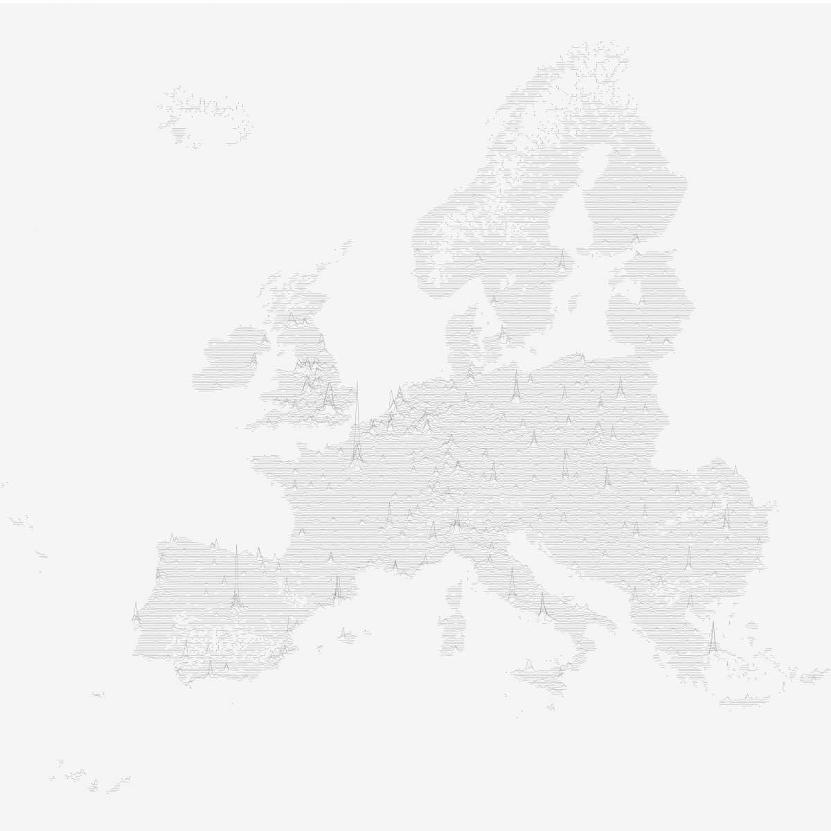
Naturally I felt challenged to replicate the result in Tableau. And lo and behold, here’s my result:
Population Lines – the Tableau Edition
At this point I’d like to thank my colleague and Data Rockstar Johanna Knapp for her final sprinkle of Tableau magic!
I do like the result quite a lot! And in contrast to the static versions by James and Henrik you can actually zoom into this one! Click here for the interactive version, hosted on Tableau Public.
How it was done
Now you are probably wondering – how is this possible? How did he do it? If not, I’m going to tell you anyways… Of course you could just follow the link to the viz on Tableau Public, download the workbook and start exploring yourself. But I’m also going to explain the few bits of magic necessary here and also in the short How To Video below.
The video
httpv://www.youtube.com/watch?v=4aFao_h7wHE
The steps
The two .csv files can easily be merged using the union feature on Tableau’s Data Source window.
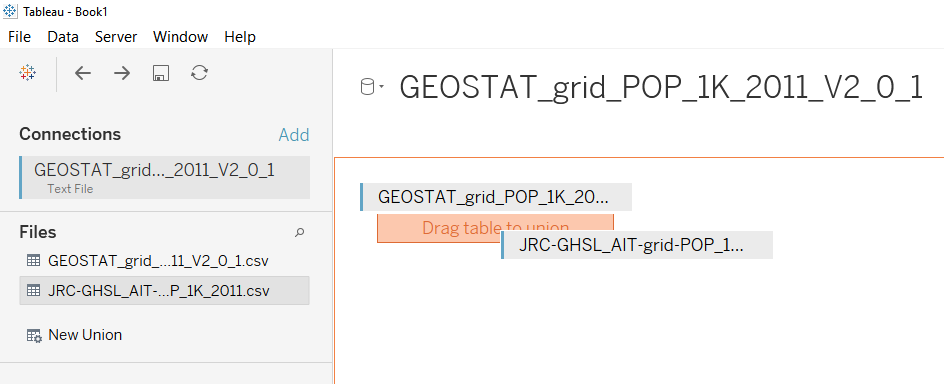
Merging two .csv files using the union feature
Next we need to extract the information from the field [Grd Id], which contains unique identifiers of all the 1×1 km grid cells. The string 1kmN0942E1916 for example contains the latitude 9.42 and longitude 19.16. The easiest way (at least in my book) is to use regular expressions. In the video above I explain in more detail how these specific regexes work, but if you want to know more about using them to extract all kinds of data from (semi-)structured strings the Wikipedia article is actually quite good. Also, a great resource to build and test your regexes is regex101.com.
These are the formulae for the two calculated fields that extract the latitude and longitude, respectively, from the [Grd Id]:
ROUND(FLOAT(REGEXP_EXTRACT([Grd Id], ".*N([0-9]+)[EW].*")) / 100, 1)
ROUND(FLOAT(REGEXP_EXTRACT([Grd Id], ".*[EW]([0-9]+)")) *
IIF(REGEXP_EXTRACT([Grd Id], ".*([EW]).*") == "W", -1, 1) / 100, 1)
We divide both by 100 to convert them to floating point numbers that are more reminiscent of actual decimal latitude and longitude values. We also round these floating point numbers to just one digit in order to make the spatial resolution coarser than the original 1 km resolution of the underlying source data. This helps us to keep the resulting lines more visually appealing. Also, make sure to convert both fields to Dimensions, and to not assign them their respective Geographic Roles, otherwise this viz will not work.
The way the spikes are being generated is by just extrapolating the latitude by the normalized (hence the WINDOW_MAX()) total number of people living in each of the aggregated grid cells. In the formula below I also introduced a scaling factor of 5, which is also what Henrik used in his map – and it just looks really good. Feel free to modify this to your linking:
MAX([Latitude]) + (5 * (SUM([Tot P]) / WINDOW_MAX(SUM([Tot P]))))
And that’s it! We have everything we need to build the population lines viz. I recommend using the Pause Auto Update button, since this allows you to build up the structure of your viz before Tableau starts rendering it for the first time.

“Pause Auto Update” button in Tableau
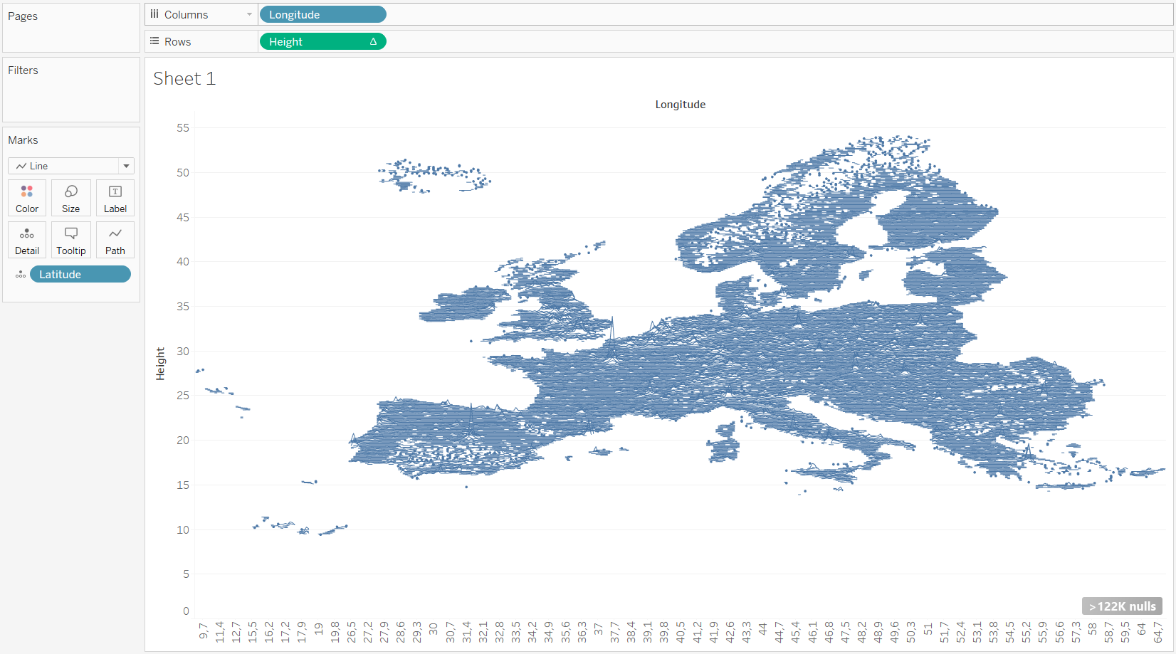
The structure in our case is to have Longitude on Columns, Height on Rows, and Latitude on Detail. Before you press “Play”, make sure to set the Table Calculation on the field Height to address both the Longitude and the Latitude:

Edit the table calculation to address both Latitude and Longitude
If the concept of addressing and partitioning or more generally the use of Table Calculations is still a mystery to you, make sure to have a look at the excellent Tableau Online Help, and also Andy Kriebel’s very recent attempt to translate Table Calcs into plain English sentences.
Finally you just need to set the Marks Type to Line (we’re generating population lines after all!), and to make sure to reduce the size to the minimum setting.
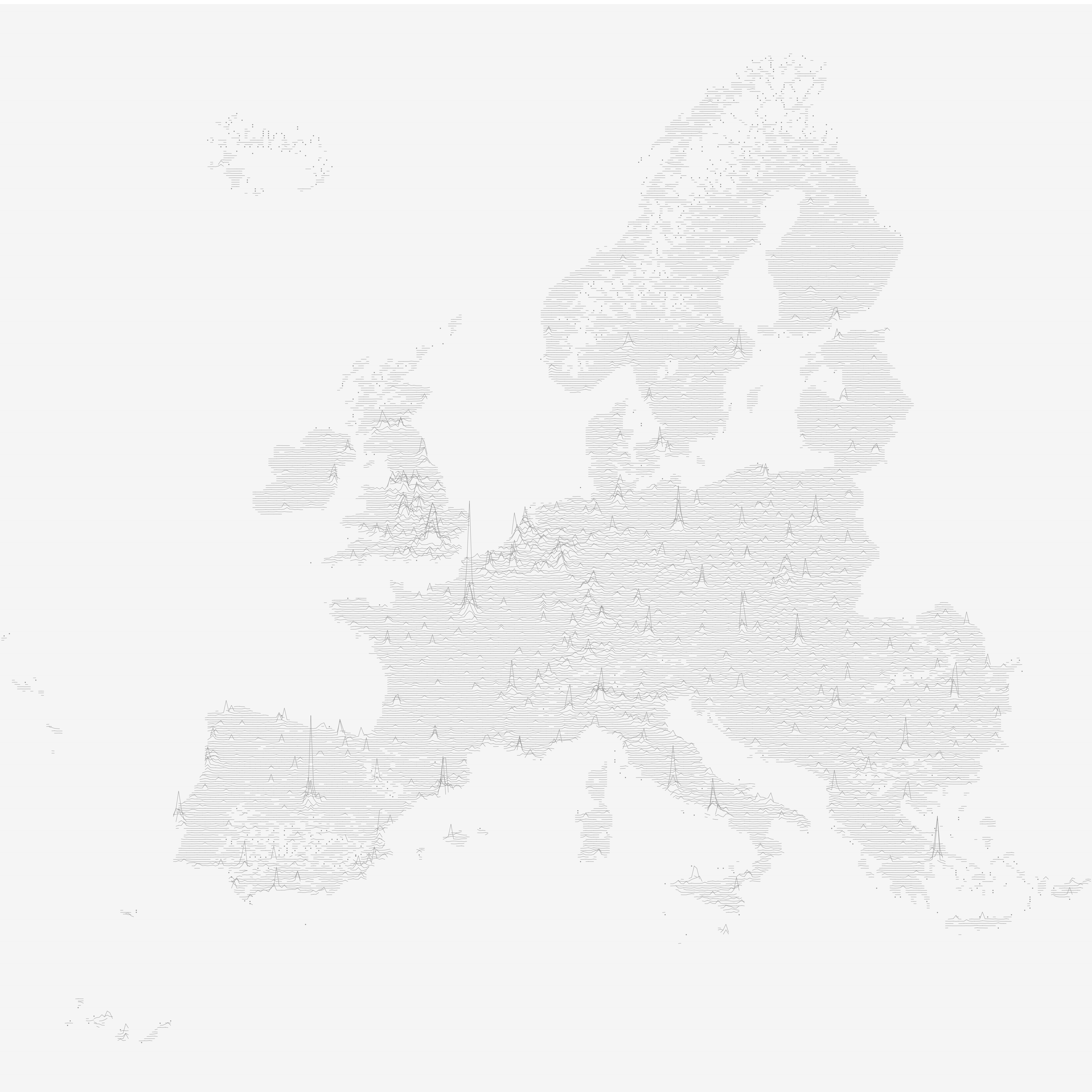
Population Lines are almost finished
Looking good! We’re almost there. Just a few final cosmetic touches like changing the line color to something more pleasing to the eye (grey, anyone?) and removing all the visual clutter like axes/headers, grid lines and the pesky NULL indicator.
And we’re done! Feel free to go to my Tableau Public page and download the finished workbook to explore and reverse-engineer at your leisure. Also, in case you have some kind of gridded data lying around somewhere (don’t we all?), please make sure to try using this approach on that data and share the result with us! And please make sure to also stop by James’ and Henrik’s posts – and maybe even get a printed version from James’ webshop.
There has been a tremendous rise in interest on this visual style in the past weeks. They even got a name now: they’re dubbed “joyplots”. Not so much because of the joy they incur with the consumers of the buzzes but because of their origin: the above-mentioned album cover by Joy Division.
No, I don’t claim that increased popularity is because of my viz, but I thought the so-inclined reader might like to know more background about the origins of the design of the album cover and its impact on popular culture. If so, here you go: https://youtu.be/reEQye0EOAw
Hat tip to James once again, who started investigating into joyplots and their origins over on his blog: http://spatial.ly/2017/07/joy-division-population-surfaces-and-pioneering-electronic-cartography/
[…] Konstantin Greger создал в Tableau Population Lines для Европы и описал процесс создания в блоге. […]
[…] Konstantin Greger cteated in Tableau the Population Lines of Europe and described the process of creation in his blog . […]
[…] mes recherches sur la construction du joyplot que j’ai découvert l’origine de ce nom. Konstantin Greger explique sur son blog que le nom dérive de l’illustration de l’album “Unknown […]
[…] mijn onderzoek naar de structuur van een joyplot dat ik de oorsprong van deze naam ontdekte. Konstantin Greger (Engelse site) legt op zijn blog uit dat de naam is afgeleid van de afbeelding op het album […]