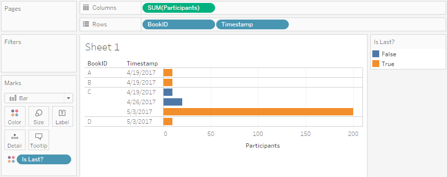
I had been planning to write this post for a long time. Not only have I been asked many times how to do this in my daily consulting work, but especially during and after my hands-on training “Stretching the Boundaries with Advanced Mapping” at our Tableau Conference On Tour 2017 in Berlin earlier this year. The question is pretty simple: How can I draw paths in Tableau? Oftentimes these are some kind of movement data, e.g. refugees or flight connections. The way to do this in Tableau is actually very easy – and some of the recently introduced features made it even easier – but it’s imperative to understand how Tableau draws lines and how the data therefore needs to be structured.

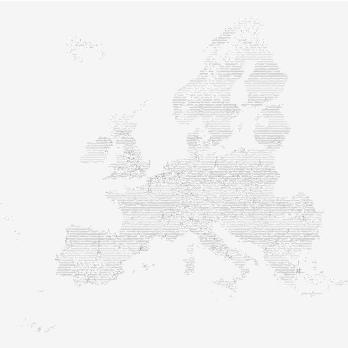
The OpenFlights.org route network visualized in Tableau