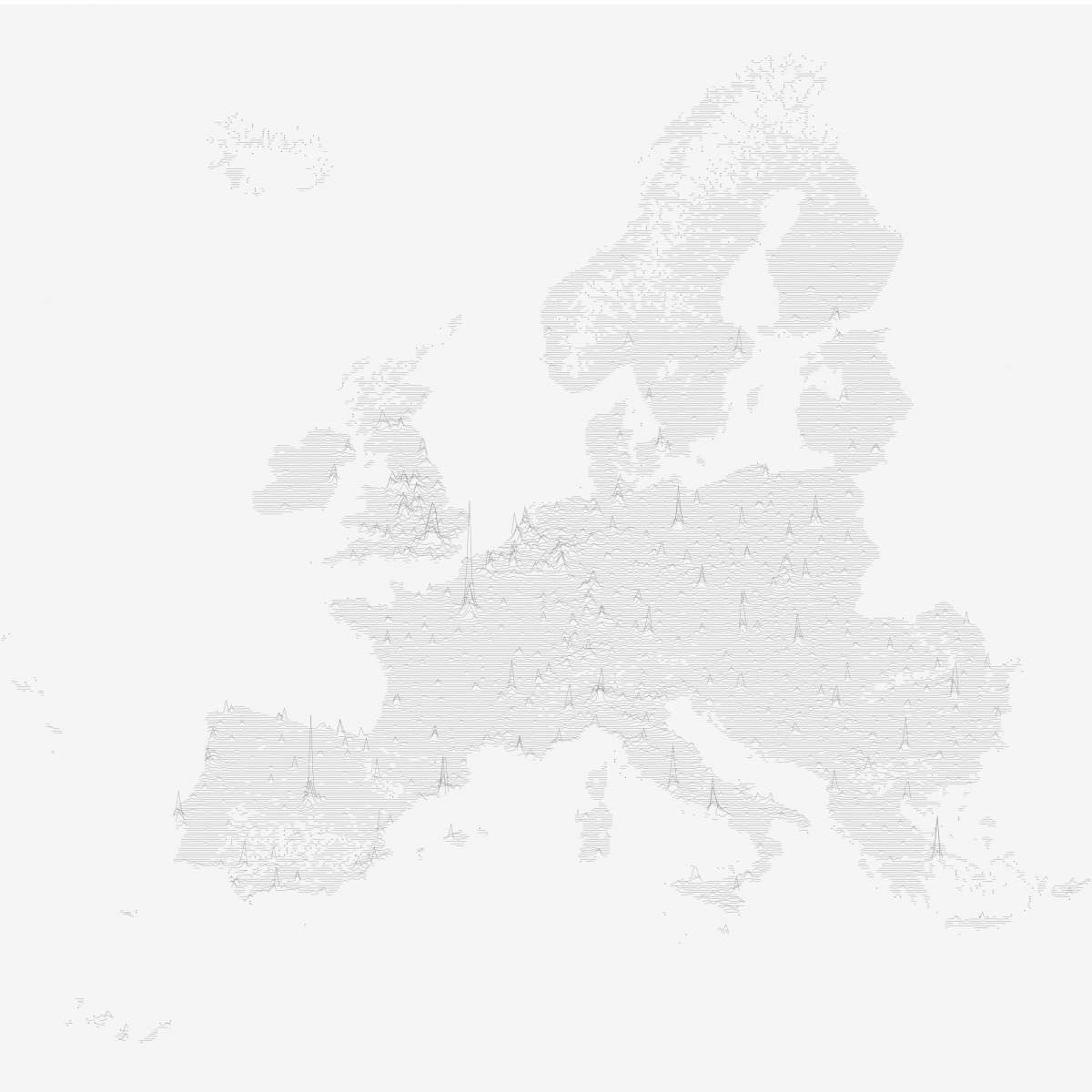
In 2013 Dr. James Cheshire from the Centre for Advanced Spatial Analysis at the University College London created a data visualization that was critically acclaimed back then and saw something of a renaissance a few weeks ago when a modified version by Henrik Lindberg made its way onto the Reddit front page. I had been mesmerized by the viz from the beginning, so when it reappeared in my blog reader I decided I had to try reproducing it in Tableau.
