In a recent blog post I showed how easy it is to create maps in Tableau showing paths, basically lines connecting two points each: the start and end locations. Those can be departure and arrival airports of certain flight routes, origin and destination of refugee flows, source and sink of money transfers, … the possibilities are endless!
But now imagine a map with a line connecting two locations A and B. Or rather many such lines. What information does this hold for you? What insights can you get out of such a viz? There is one very important element still missing! That is: which direction is this connection? Sure, there are cases where direction doesn’t matter, but thinking of the three aforementioned example use cases, many times it does! So let’s give our connecting paths some directionality. Let’s take simple lines and make them arrows!
The easiest way to give your lines some direction is by making one end look different than the other. Color is one option, although it’s hard too see on a busy plot, Size is another:
Simple lines with size for directionality
But neither Size nor Color don’t make it immediately obvious, which way the line is directed… So that’s not a good solution. Remember that your vizzes should always be self-explanatory – they’re like a joke: if you have to explain it, it ain’t good. Let’s find a better way, then.
The process of getting from lines to directed arrows is very similar to what we’ve seen in the blog post on drawing the paths on the map, only with a little additional twist. Because maps are complicated, let’s simplify matters for now and just draw arrows on scatterplots. The Tableau nerds amongst you of course know that maps are but a very special kind of scatterplot to Tableau, but projections – especially the Web Mercator Tableau uses – just add another degree of complexity, which we will save for a second article.
Step 1: Get the data
I love airplanes. So using the flight connections data again is the obvious choice! For this tutorial, though, we will first use a very simple data set that allows us to better understand what is going on and why. The basic requirements stay the same as in the case of simple lines, only this time we need three files:
- a list of connections connecting two points (e.g. our flight routes)
- a list of point locations (e.g. the airports)
- a metafile defining the arrowheads
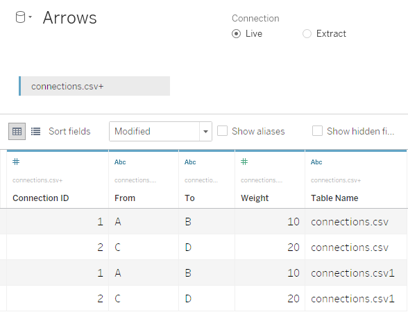
Connection ID;From;To;Weight
1;A;B;10
2;C;D;20
Point ID;X;Y
A;2;2
B;10;10
C;7;1
D;3;11
Corner ID;Degrees
2;160
4;200
Here all three files are simple text files, the structure is pretty self-explanatory. Let’s not go into the third file for now, we’ll save that for later. Spoiler alert: This is where the magic happens! Well, some of it…
Step 2: Get the basics done
My last post on this topic has an extensive explanation of how to draw paths, so here’s just the very short version:
- Load the connections’ file
- Union it with itself – this will add a new field
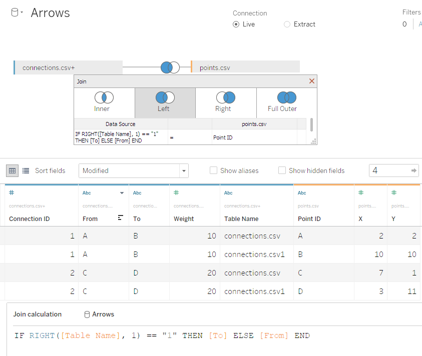
[Table Name]to that data source: - Join the points’ file using a Calculated Join to combine on either
[From]or[To]:IF RIGHT([Table Name], 1) == "1" THEN [To] ELSE [From] END. Make sure it’s a left join. - Create
[Path ID]using the same approach:IF RIGHT([Table Name], 1) == "1" THEN 2 ELSE 1 END - Make
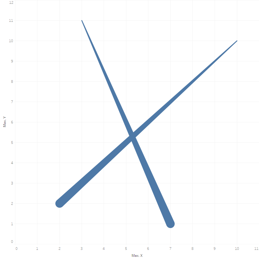
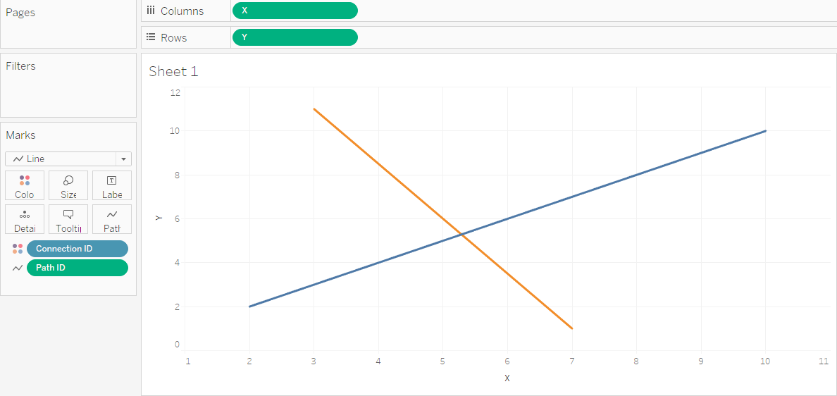
[X],[Y], and[Path ID]continuous dimensions, then drag[X]to Columns,[Y]to Rows,[Connection ID]to Color, change the Marks Type to “Line”, and finally drag[Path ID]to Path. Presto – we can see our two paths!
Creating Paths in Tableau: Self-union the connections’ file
Creating Paths in Tableau: Calculated Join between connections and points files
Creating Paths in Tableau: Build the viz
Step 3: Make a plan and get the maths down
So we have the lines on the viz, how can we make them arrows? Here’s my suggestion, what I call the “linear approach”. Let’s break it down visually, so we’re all on the same page:
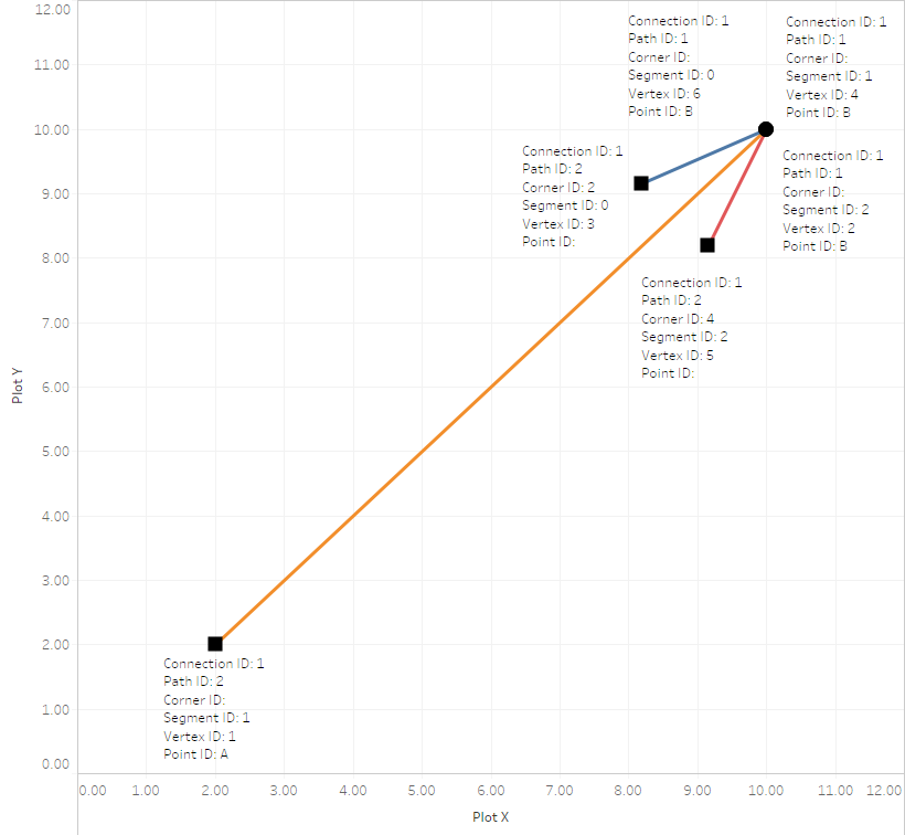
The structure of an arrow in Tableau
You probably got the idea why I dubbed this the “linear approach” – because we dissected the arrow into three components, each of them being a line:
- One of them (the orange one with a
[Segment ID]of1in the image above) is our original line, the connection between the start and end locations. The other two (blue and red with[Segment ID]s0and2in the image above) make up the actual arrowhead. - Each of our three lines still consists of two vertices (that’s just a funky term for “points”) at two different locations and with
[Path ID]s1and2as we saw earlier. - All three lines share one common location, which is the tip of our arrow – it’s the
[Path ID]of1for all three lines.
Easy, right? So now two big questions remain:
- How do we create three lines when there’s only one in our data?
- How do we determine the locations for the endpoints (
[Path ID]of2) for our two additional arrowhead lines ([Segment ID]s0and2)?
The answer to the first one is rather easy. Remember how we were able to draw one line between two points by self-unioning the connections with themselves and then joining them to the point locations? That gave us one line. So in order to create three lines out of thin air (so to speak) we simply need to do the same thing three times. “But isn’t that going to massively blow-up the number of records in my data set?” I hear you cry. Well yes, it certainly does! I multiplies the number of records by the factor six. So our two arrows pointing from A to B and from C to D will result in 12 rows of data. Luckily Tableau has no trouble dealing with very long data sets, so this shouldn’t be too much of a concern, as we will see in the next blog post with a real-world example. So instead of a self-join with two instances of the same file as in the simple example above we will now join a total of six instances of the connections’ file. The join logic stays the same as before, and again it should be a left join.
The answer to the second one is a bit more complex and involves some math. If you faint easily at the sight of trigonometric formulae you might want to skip the next few paragraphs and just trust me on this one. Everybody else, welcome to the messy bits! Also, I uploaded a workbook with all intermediary steps and the final arrows to Tableau Public. So feel free to download that and reverse-engineer all the good stuff in there.
Now that we deconstructed each arrow into the actual line and the arrowhead, which in and of itself also contains of two lines – usually shorter than the actual line -, we can start thinking about how to draw those three lines. To do so we need to calculate the locations for the endpoints ([Path ID] of 2) for our two additional arrowhead lines ([Segment ID]s 0 and 2). This is where the third file mentioned above comes into play: the metafile defining the arrowheads. As you can see from the field name we’re doing this using angles.
In order to use the file we have to include it in our data model. This is done very easily by joining the six-fold connections.csv self join with the corners.csv using a Calculated Join INT(RIGHT([Table Name], 1)) on the left-hand side and the field [Corner ID] on the right-hand side:
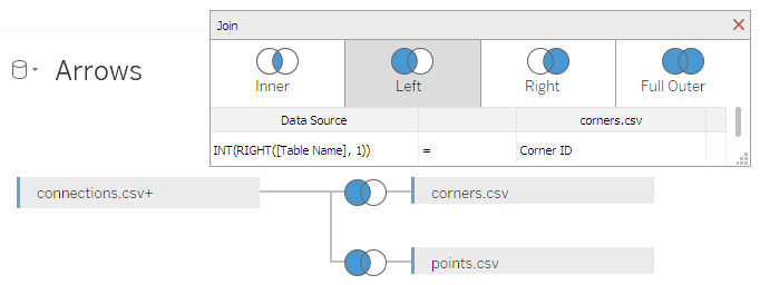
Join the six-fold connections’ self-join to the corners’ metadata file
Imagine a full circle with radius  around the tip of the arrow (the point where all the
 [Path ID]s 1 are. “Full circle” means 360 degrees, or – since Tableau calculates in radian –  . If we assume our prototype arrow will be a horizontal line from left to right, setting the arrowhead angles to 160 and 200 degrees, respectively, this will give us a nice and pointy arrowhead (some imagination on your end is required here…):
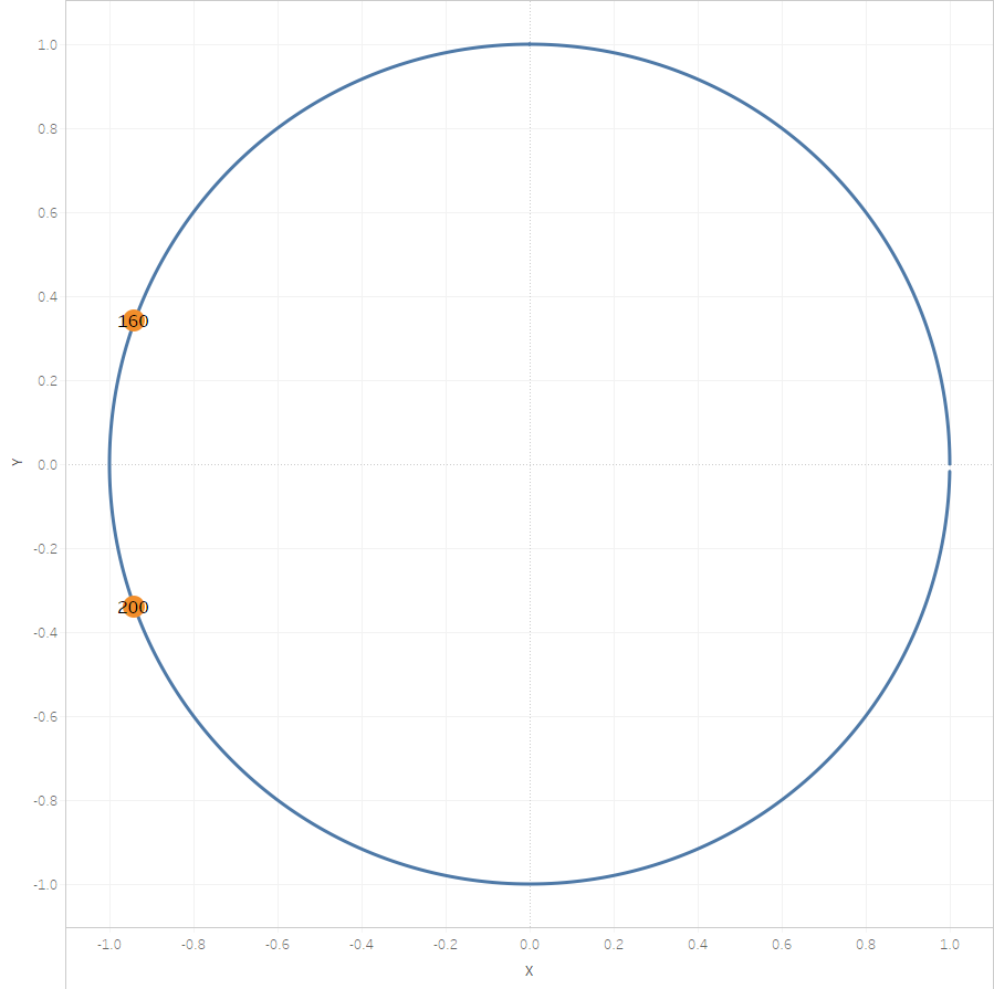
Angles of the arrowhead lines’ endpoints at 160 and 200 degrees
You can find an interactive version of this view in the workbook accompanying this blog post on my Tableau Public portfolio page.
So using this metafile we can later on define the shape of our arrowheads, which is neat, since there’s no need to hardcode the angles now. But rarely will our arrows only be straight lines, so we need to account for the angle of the actual line, before calculating the arrowhead line locations of each arrow. This is where trigonometry strikes again! This angle of a line (strictly speaking, its inclination or slope)  can be calculated by the following simple formula:
![\[ m = \frac{y_{end} - y_{start}}{x_{end} - x_{start}} \]](https://konstantingreger.net/wp-content/ql-cache/quicklatex.com-a480a118e1c0d56ebbeb35acd4950110_l3.png "Rendered by QuickLaTeX.com")
In other words, we need to tell Tableau to:
- establish the start (
[Path ID]of1) and end ([Path ID]of2) coordinates of each line (denoted by[Connection ID]), - calculate the difference in both horizontal (
[X]) and vertical ([Y]) direction per line (again, denoted by[Connection ID]), - and finally calculate the slope per line (still denoted by
[Connection ID]).
I did this using a total of seven Calculated Fields, just to keep it clean – feel free to combine them into one behemoth of a calculation if you’re so inclined. (See what I did there?)
First the four coordinates per line – no big surprises here, just one FIXED LOD expression and an IF condition:
[X Start]
{ FIXED [Connection ID], [Path ID]: MAX(IF [Path ID] == 1 THEN [X] END) }
[X End]
{ FIXED [Connection ID], [Path ID]: MAX(IF [Path ID] == 2 THEN [X] END) }
[Y Start]
{ FIXED [Connection ID], [Path ID]: MAX(IF [Path ID] == 1 THEN [Y] END) }
[Y End]
{ FIXED [Connection ID], [Path ID]: MAX(IF [Path ID] == 2 THEN [Y] END) }
Next the differences in both orientations – again no big deal, using some simple LOD magic, this time only on the level of [Connections ID]s:
[X Diff]
{ FIXED [Connection ID]: MAX([X Start]) - MAX([X End]) }
[Y Diff]
{ FIXED [Connection ID]: MAX([Y Start]) - MAX([Y End]) }
And lastly the only slightly more involved bit:
[Line Slope]
{ FIXED [Connection ID]: MAX(DEGREES(ATAN2(ZN([Y Diff]), ZN([X Diff])))) }
Apart from the host of parentheses (LISP?!) it’s actually not that complicated: Using yet another FIXED LOD on the level of [Connections ID]s we are calculating the arctangent of the line described by [X Diff] and [Y Diff]. Tableau uses the ATAN2() function for this purpose (see here). Since our IF conditions earlier created a lot of NULLs we have to ZN() (see here) them so ATAN2() doesn’t choke. As mentioned above, Tableau calculates angles in radian, but since these don’t mean anything to most people, DEGREE() then translates the slope into degrees … and we’re done!
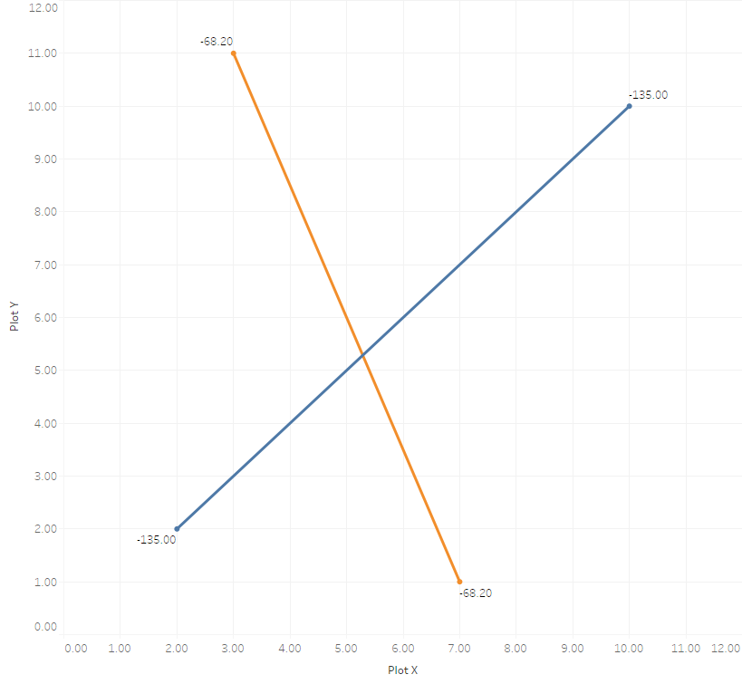
Slopes of the two actual lines
Now that we know the slope of each line we also know by how many degrees we have to rotate our arrowhead lines, whose angles we defined earlier in the third input file. And this is where the actual magic happens, I’m afraid, is where things are about to get ugly. The last missing bit is how to calculate the locations of the arrowhead lines’ endpoints ([Path ID] of 2), marked by squares in the image above.
When we doubled our connections file earlier to get from points to lines we used a neat little trick: we evaluated the right-most character of the new field [Table Name] Tableau automatically creates with each Union – if it’s a “1” it’s the second instance of the file, a.k.a. our endpoint, otherwise it’s the first instance of the file, a.k.a. our starting point. (This assignment by the way is absolutely arbitrary, just make sure you follow through with whichever direction you decided to interpret them in.) That was all nice and dandy when we were dealing with two instances of the points’ file, but remember that now there’s six of them! Accordingly Tableau calls them connections.csv, connections.csv1, connections.csv2, and so on until connections.csv5. To keep things clean I decided to introduce a Calculated Field to keep track of that order, albeit making it 1-based (1-6) instead of 0-based (0-5), which I understand might confuse one or two people, but it helps us greatly with some upcoming calculations:
[Vertex ID]
ZN(INT(RIGHT([Table Name], 1))) + 1
We can then, instead of directly parsing it out of the [Table Name] again, use this new [Vertex ID] to calculate the [Path ID]. Remember, even though we’re now dealing with three line segments and six times the number of actual lines, there will still be only [Path ID]s of 1 and 2, since that’s all we need per line. So we can use modulo to get to those [Path ID]s without the expensive string operations we used so far:
[Path ID]
IF [Vertex ID] % 2 == 0 THEN 1 ELSE 2 END
Lastly we also need to extract the [Segment ID] out of the [Table Name]s in order to be able to identify the three line segments, i.e. the actual line (the orange one with [Segment ID] of 1 in the image above) and the other two (blue and red with [Segment ID]s 0 and 2 in the image above) for the actual arrowhead. We’re using some little maths trick here again and evaluate the modulo of a division by 3 rounded up to the next integer:
[Segment ID]
CEILING([Vertex ID] % 3)
[Vertex ID], [Path ID], and [Segment ID] should be discrete dimensions.
Finally it’s time to calculate the actual positions of out lines’ vertices! We’ll treat the arrows’ tips a bit differently, because they are being reused three times per arrow:
[Tip X]
{ FIXED [Connection ID]: MAX(IF [Path ID] == 1 THEN [X] END) }
[Tip Y]
{ FIXED [Connection ID]: MAX(IF [Path ID] == 1 THEN [Y] END) }
Remember that [Path ID] will always be 1 for the line ends that equal the [To] locations of the arrowheads. So evaluating for [Path ID] == 1 per [Connection ID] (i.e. per arrow) will give us the [X] and [Y] locations of the tips.
Lastly – and I promise that this is the final step -, we can calculate the remaining vertices’ locations. There’s three of them left: the start of the actual line and the starting points of the two arrow head lines. This gives us the following, admittedly rather contrived, conditional statements:
[Plot X]
IF ISNULL([Point ID]) THEN
{ FIXED [Connection ID], [Corner ID]: MAX([Tip X] - COS(RADIANS(ZN([Degrees]) + [Line Slope] + 180)) * [Scaling Factor])}
ELSE [X]
END
[Plot Y]
IF ISNULL([Point ID]) THEN
{ FIXED [Connection ID], [Corner ID]: MAX([Tip Y] - SIN(RADIANS(ZN([Degrees]) + [Line Slope] + 180)) * [Scaling Factor])}
ELSE [Y]
END
Let’s dissect them piece-by-piece. [Point ID], as we just saw, can either be NULL or hold a value (either the same as [From] or [To]). In the latter case we just take the respective [X] or [Y] coordinate and be done with it. The former case are our arrowhead lines’ starting points. Their [Corner ID]s evaluate to either 2 or 4, as that’s what we defined in the third input file all the way in the beginning (so in case you were wondering back then – there’s your answer). We then add the [Degrees] (ZN()‘ed to take care of potential NULL values), that’s again the angle we defined in the input file – our arrowhead model if you like -, to the actual line’s slope as calculated in [Line Slope], plus 180 degrees to give us the actual rotation of each of the arrowhead lines. Since these are in degrees we need to convert them to radian again, before we can use some more trigonometry to evaluate the COS() (for the [X] dimension) and SIN() (for the [Y] dimension) and subtract these from the arrow tip locations to ultimately get out point locations. If you’re wondering about this [Scaling Factor] in the last calculation, this is just a parameter that allows us to define the size of the arrowheads. I implemented it as a simple integer parameter. [Tip X], [Tip Y], [Plot X], and [Plot Y] should be continuous dimensions.
Whew! Congratulations if you made it through this paragraph without developing a headache. While we at Tableau don’t really like text tables, this is one of those cases where they come in really handy – especially when working with such a small example data set – as it allows us to exactly see what information is stored in which field in what configuration:
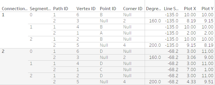
A small table to show us what our fields look like
Remember, that not only this table but all the intermediary steps are on Tableau Public for your reference – please go ahead, download the workbook and reverse-engineer from there.
Step 4: Enjoy
So there you go! Directed arrows in Tableau.
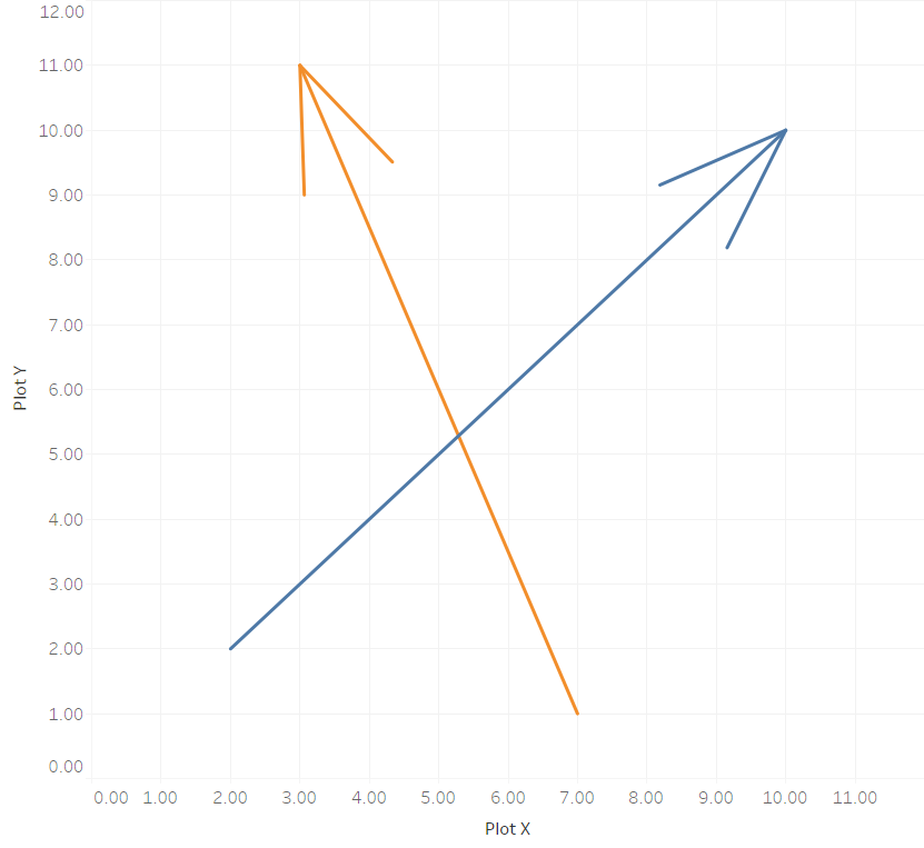
Directed arrows on a Tableau scatterplot
In the next article I will then write about how to plot directed arrows on maps, which is a bit more complicated due to the map projection Tableau uses. So brace yourself for some more calculations and trigonometry!
[…] Giving your Flows a Direction in Tableau […]
Hi Konstantin,
Thanks for these posts on creating paths in Tableau. I have used your examples and others including the Data-surfers to create my own network diagram.
However, I am having trouble replicating this tutorial to get arrows for my network diagram. I am thinking the issue surrounds the joins, however I have used the exact criteria you specify.
You mention that you have nulls for the Point ID in your data – however with a left outer join to the Connections (“Edges” in my dataset), you will always have a Point ID… or at least that is what is happening in my data – every row has a Point ID (just ‘ID’ in my dataset), which means the Plot X and Plot Y calcs are not going to work.
Would you be willing to take a look at my dataset and workbook? I’ve been at this for hours and hours – and the utility of my diagram is limited without directionality.
Reed Sutton
Apologies for the very late reply. If you’re still struggling with this topic I’d be happy to have a look at the issue.
Hi – terrific article, really helping me grasp custom line drawing.
A question though: why did you choose to self-join instead of creating a single table containing the required numbers? Is there a benefit one way over the other, or just personal preference?
Thanks
-rlm
Excellent question! Basically, I decided for this way, as it was what my data was structured like.
Having immense difficulty replicating the self-join 6 times. Would love some clarity on how exactly you did this. Can share in detail what my structure looks like if this account is still active.
Thanks for the great work
You can follow the guidance on the official Tableau Help, and then drag the same table in six times to perform the 6-fold self-join. In the data grid you will see six instances of your data, where the automatically added column “Table Name” will go from “yourtable.csv” to “yourtable.csv1”, all the way up to “yourtable.csv5”.
Hi, thanks a lot for the detailed instruction! A small question: for the calculated field [Path ID], “from” point was coded as 1, and “to” point was coded as 2, so it seems that the arrowhead point should be the point where the [Path ID] is 2 instead of 1. It does not matter in this sample dataset, but the direction would be the opposite with the routes/airports data? Thanks again, and appreciate your comment if I misunderstood anything, since I am still in the process of trying to relicate this viz :)
Excellent point! Thanks for identifying this little mishap – you’re absolutely right.
This blog is exactly what I have been looking for, however can you share description of 3rd file i.e. “metafile defining the arrowheads”. I do not have that file and without context to this file, I am not able to create this metafile.
It would be great if you can explain or share metafile.
The contents of the file is very simple, basically just a list of the two IDs (2 and 4 in my example) and the corresponding angles in degrees:
Corner ID;Degrees2;160
4;200
It’s briefly introduced near the end of Step 1.