This is the continuation of a blog post I published a few weeks ago on how to draw directed arrows in Tableau. The approach introduced there – I dubbed it the “linear” approach, as instead of drawing one line we created two additional lines for the arrowheads – works fine on scatterplots, but things turn out to be a bit more difficult when working with maps. This article shows how these difficulties can be overcome using some on-the-fly reprojection of our data. While I claim the arrows to be my original idea (at least I didn’t find anything similar on the web – please correct me if I’m wrong!), I can’t and won’t take credit for this one. All original work was done by Alan Eldridge and the @mapsOverlord herself, Tableau’s Sarah Battersby in an article on hexbinning on Alan’s blog back in 2015. Sarah is an absolute expert on all things map projection, as she has shown time and time again in articles on the topic on the official Tableau and Tableau Public blogs and elsewhere (as in: real scientific publications).
So, in the last article we worked with a very small dataset that helped us grasp what was going on with the data in all the numerous Calculated Fields (there’s 14 of them, actually). Now it’s finally time to use some interesting, real-world data, that actually makes sense, and also proves my point that multiplying the data six times doesn’t even make Tableau break a sweat. So back to the super cool OpenFlights.org data which I have already used in my blog post on visualizing paths in Tableau and also in another context when writing about the new great circles feature in Tableau with Sarah over on the Tableau blog. You can find some details about how to get that data, what’s in there and some necessary preprocessing steps in that first article.
Assuming you’ve done all that, let’s see what happens if we apply the logic we developed for scatterplots on a map:

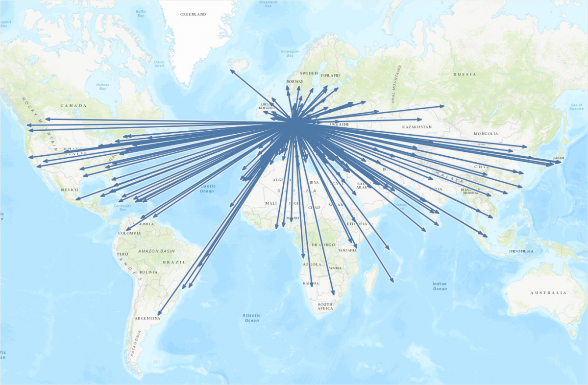
Plotting all flights from Frankfurt (FRA) as arrows on a map
Whoa! That is so cool! When I did this for the first time I was really happy with the result. For about 15 seconds. That’s when I noticed some major flaws with this map. Can you spot them? If not, have a closer look and compare the arrowheads for flights to the Northern USA & Canada, Iceland, Sweden, and Saudi-Arabia:
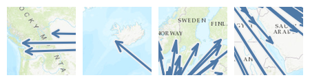
Those arrowheads don’t look right…
Some arrowheads just don’t look right. And worst of all: they don’t all look the same! But looking at them, or rather their geographic distribution, already gives us a hint at what might be going on here. The culprit’s name is “Web Mercator”! So the map projection Tableau uses to display maps is raining on our parade. Not cool!
What can we do about it? How can we fix it? Luckily, while Web Mercator has its flaws and disadvantages (check out https://thetruesize.com to get a basic understanding of why it’s hated and its use discouraged by so many people), it also has two very nice properties: one being the fact that it projects the world to a square (which mainly helps computers render tons of little squares, so-called tiles to quickly display a map of any location at any zoom level); the second being that it disregards the fact that our Earth is not actually a sphere but a weirdly shaped spheroid and accepts a few minor distortions at the benefit of way easier math being involved in the projection calculations.
As it turns out the distortion introduced by this map projection causes our arrowheads to look different according to the latitude it’s plotted at. So we should calculate the angles and everything else using a different, non-distorting – also called conformal – map projection. Now here’s the One-Million-Dollar-Question: When do we need to reproject our coordinates? Before or after calculating the arrowheads? It’s a trick question, actually, the answer being: both. While our original coordinates (the longitude and latitude of the airports) are stored in WGS84 and Tableau also uses these to render the maps, the calculation of all the angles and additional coordinates involved in the creation of the arrows has to happen in Web Mercator, the so-called “projection space”. So first we reproject the original WGS84 coordinates into Web Mercator, followed by the execution of all necessary calculations while still in Web Mercator space, and then lastly the reprojection back into WGS84. Nerd note: Funny enough Tableau will then take these and calculate the coordinates to be rendered on a Web Mercator map…
I uploaded a workbook containing all the necessary calculations to my Tableau Public profile, so feel free to download it and have a look at what’s happening there. I went to great lengths in an attempt to document it as completely as possible. As all the distortion introduced by Web Mercator is happening on the latitude, this is where the bulk of the transformation needs to happen:
![\[ latitude_{Web Mercator} = r_{Earth} * \ln{\tan({\frac{\pi}{4} + \frac{\varphi}{2}})} \]](https://konstantingreger.net/wp-content/ql-cache/quicklatex.com-616b7fff771c07487afcdfe700aa81bc_l3.png "Rendered by QuickLaTeX.com")
In Tableau this bring us to the following Calculated Field:
[Original Latitude in WM]
[Earth Radius (m)] * LN(TAN((PI() / 4) + (RADIANS([Original Latitude]) / 2)))
The radius of the Earth  is hard-coded here as a parameter, the
 [Original Latitude] is, well, the original latitude of the point locations (here: airports). Note that Tableau wants radian instead of degrees, hence the RADIANS() function in there. Compared to that, the longitude is super simple:
[Original Longitude in WM]
[Earth Radius (m)] * RADIANS([Original Longitude])
As a next step we will do all the calculations and processing as outlined in the previous article. Only this time all angles and positions will be based on the Web Mercator coordinates we just derived. The final step is then to reproject these plot coordinates back into the Latitude/Longitude-based WGS84 geodetic system, by basically reverting the two calculations we introduced above:
[Plot Latitude]
DEGREES(2 * ATAN(EXP(([Plot Latitude in WM] / [Earth Radius (m)]))) - PI() / 2)
[Plot Longitude]
DEGREES([Plot Longitude in WM]) / [Earth Radius (m)]
There we go! Our arrows are now perfectly uniform, no matter their location and direction. Just compare the uncorrected arrows on the left with the corrected ones on the right:
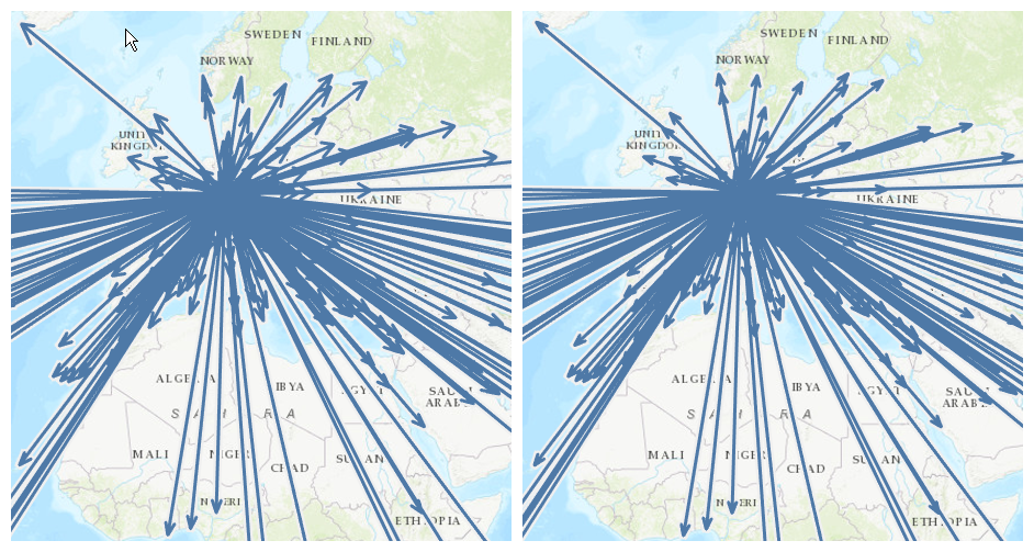
Uncorrected (left) vs. corrected arrowheads (right)
And here is our final map in all its glory:

Perfectly uniform arrows on a map in Tableau
Remember that an interactive version is also available on my Tableau Public profile, which even allows you to dynamically select the origin airport of your choice. Enjoy!
Love it!!!
[…] Show me the Way: Putting Directed Arrows on Maps in Tableau […]