Perfectly uniform arrows on a map in Tableau

Show me the Way: Putting Directed Arrows on Maps in Tableau

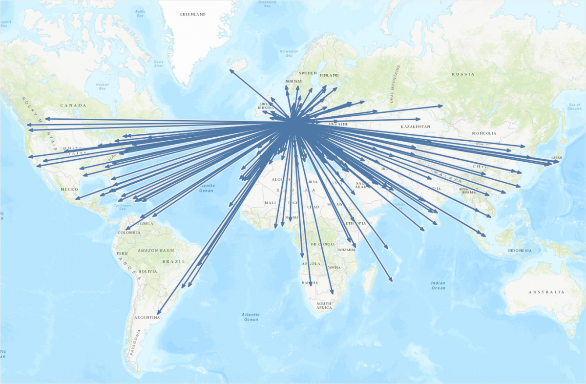
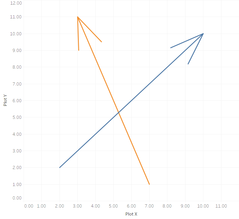
This is the continuation of a blog post I published a few weeks ago on how to draw directed arrows in Tableau. The approach introduced there – I dubbed it the “linear” approach, as instead of drawing one line we created two additional lines for the arrowheads – works fine on scatterplots, but things turn out to be a bit more difficult when working with maps. This article shows how these difficulties can be overcome using some on-the-fly reprojection of our data. While I claim the arrows to be my original idea (at least I didn’t find anything similar on the web – please correct me if I’m wrong!), I can’t and won’t take credit for this one. All original work was done by Alan Eldridge and the @mapsOverlord herself, Tableau’s Sarah Battersby in an article on hexbinning on Alan’s blog back in 2015. Sarah is an absolute expert on all things map projection, as she has shown time and time again in articles on the topic on the official Tableau and Tableau Public blogs and elsewhere (as in: real scientific publications).

Continue reading →

Directed arrows on a Tableau scatterplot

Giving your Flows a Direction in Tableau

In a recent blog post I showed how easy it is to create maps in Tableau showing paths, basically lines connecting two points each: the start and end locations. Those can be departure and arrival airports of certain flight routes, origin and destination of refugee flows, source and sink of money transfers, … the possibilities are endless!

But now imagine a map with a line connecting two locations A and B. Or rather many such lines. What information does this hold for you? What insights can you get out of such a viz? There is one very important element still missing! That is: which direction is this connection? Sure, there are cases where direction doesn’t matter, but thinking of the three aforementioned example use cases, many times it does! So let’s give our connecting paths some directionality. Let’s take simple lines and make them arrows!

Continue reading →

GIS & Spatial Analysis – “My” magazine on FlipBoard

I have been maintaining it for quite a while now, but it was only today that I found out that it can also be accessed outside its native app on the web: “my” magazine on FlipBoard.

GIS & Spatial Analysis - Flipboard

I called it GIS & Spatial Analysis, and that’s exactly what its contents is all about: I “flip” (that’s the FlipBoard lingo for sharing) everything in here I deem interesting and newsworthy from the world of digital maps, spatial data and spatial analysis. Sometimes it’s rather scientific contents, sometimes it’s just interesting or even going to make you smile. If you’re a map and GIS geek like me, that is…

Obviously it’s for free – so go ahead enjoy! The native app is available for iPad, iPhone, Android, Kindle Fire and NOOK – also for free.

Batch-Loading and Merging Shape Files Into PostGIS

Today I was faced with the task of having to load a massive amount of shape files into my PostGIS database. The data in question is the Advanced Digital Road Map Database (ADF) (拡張版全国デジタル道路地図データベース) by Sumitomo Electric System Solutions Co., Ltd. (住友電工システムソリューション株式会社). It contains very detailed information (spatial and attributive) about the road network of all Japan and is thereby quite heavy.

Therefore, it was split into a plethora of files using the following naming schema: mmmmmm_ttt.shp, where mmmmmm represents a six-digit mesh code and ttt represents a 2- to 3-digit thematic code. The mesh code is a result of the data being split spatially into small, rectangular chunks. It follows a simple logic, whereby bigger mesh units (represented by the first four digits) are further subdivided into smaller units (represented by the last two digits). It took only a small amount of time to figure out this naming schema and filter the files that would be necessary for my analysis.

Basically I wanted to merge the shape files into PostGIS tables divided by their topic (i.e. road nodes, road links, additional attribute information, etc.). So I had to find a way to batch import the shape files into PostGIS and merge them at the same time. Yet, since the node IDs were only unique within each mesh unit (i.e. shape file), I also had to find a way to incorporate the mesh codes themselves into the data, so I could later on create my own ID schema for the nodes, based on the mesh code and the original node ID (e.g. mmmmmmnnnnn, where mmmmmm represents a six-digit mesh code and nnnnn represents the original 5-digit node ID).

Continue reading →

Working With Non-Unicode Data in Python

Being a researcher in Japan means I often have to work with Japanese data. While generally data is data is data, there are some peculiarities I came across that seem to be related to the fact that those data are about and produced in Japan.

Firstly there is the way they are delivered. I’m no so much talking about deliveries on “hard media” such as CD-ROMs and DVDs being snail-mailed, even though this seems to be the major way of obtaining data until this day. Luckily I’m embedded in an ecosystem of research institutions and university laboratories that engage in joint research projects and thereby share the necessary datasets online using portal websites. I’d especially like to mention the JoRAS portal of the Center for Spatial Information Science (CSIS) at the University of Tokyo (東京大学) here, since their stock is quite extensive and they are always open for collaboration inquiries.

Secondly there is the fact that, not very surprising, Japanese datasets often contains Japanese data. By this I’m not referring to the fact that this data is dealing with information about Japan, but to the fact that it is making use of Japanese script. This introduces some technical difficulties, which I would like to elucidate in this article.

Continue reading →