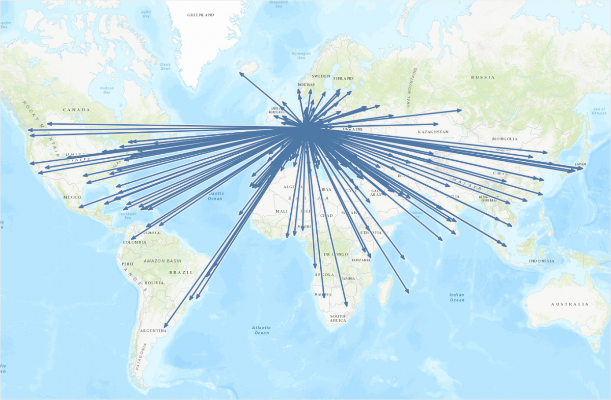
This is the continuation of a blog post I published a few weeks ago on how to draw directed arrows in Tableau. The approach introduced there – I dubbed it the “linear” approach, as instead of drawing one line we created two additional lines for the arrowheads – works fine on scatterplots, but things turn out to be a bit more difficult when working with maps. This article shows how these difficulties can be overcome using some on-the-fly reprojection of our data. While I claim the arrows to be my original idea (at least I didn’t find anything similar on the web – please correct me if I’m wrong!), I can’t and won’t take credit for this one. All original work was done by Alan Eldridge and the @mapsOverlord herself, Tableau’s Sarah Battersby in an article on hexbinning on Alan’s blog back in 2015. Sarah is an absolute expert on all things map projection, as she has shown time and time again in articles on the topic on the official Tableau and Tableau Public blogs and elsewhere (as in: real scientific publications).


