Today I stumbled across something I wouldn’t exactly consider a bug, but at least some rather unintuitive and annoying behavior in QGIS when performing table joins.
I did something very mundane: joining a Postgres table of spatial data to another Postgres table of attribute data. The normal way to do this (for me) is as follows:
- Open the spatial table using
Layer > Add Layer > Add PostGIS Layers...
- Open the attribute table the same way (1 & 2 can be loaded in one go)
- Join the tables in the spatial table’s
Properties dialog.
For that last step I decided to join the two tables (plr is the spatial table here, while mss has the attributes) using the field plr_id, which exists in both tables and only once on each side (hence a plain vanilla 1:1 join).

Add vector join dialog window in QGIS 2.8
That works perfectly fine, except that somehow the order of the joined fields appears to get messed up:

QGIS attirbute table with erroneously shifted field contents
Some research revealed that this seems to be a problem caused by identical field names in the two joined tables other than the join field itself. In my case the aforementioned plr_id was used to join the two tables, but in addition both tables also had a field gid, as can be seen in the following screenshot on the left:
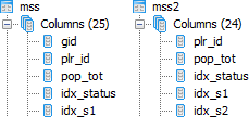
Table design in pgAdmin: original table including field gid on the left, fixed table without (unnecessesary) field gid on the right
Removing this field gid from the attribute table mss was no problem, since the 1:1 relation to the spatial data uses the key plr_id anyways. As can be seen in the screenshot above on the right, the new table mss2 is identical to mss, only without the field gid. And lo-and-behold – joining this attribute table to the spatial table plr in QGIS works flawlessly now:

QGIS attirbute table with correct field contents
This problem had already been identified in QGIS 2.0 in late 2013, and has been marked as fixed in the meantime. Removing fields with identical names in the two tables is one – admittedly rather radical way – to solve circumvent the issue. Another, more intuitive way would be to choose a meaningful table prefix in the Add vector join dialog which can be seen in the first image above. As you can see I checked the Custom field name prefix checkbox but left the field empty. I prefer this, since it keeps my field names nice and tidy, but in cases where homonymous fields exist in the two tables you will run into trouble – hence entering a prefix here would be a nice and easy fix for this issue.
Everything described above was performed on QGIS 2.8.1-Wien (64bit) on a Windows 7 machine and PostgreSQL 9.1.16 on a 64bit Ubuntu 4.6.3 server (PostGIS 1.5.3).