Embedding R Plots in Tableau Dashboards

“R you nuts?” is what my colleague asked me when I once proposed this little hack. He’s not completely wrong, we’ll get to that later…

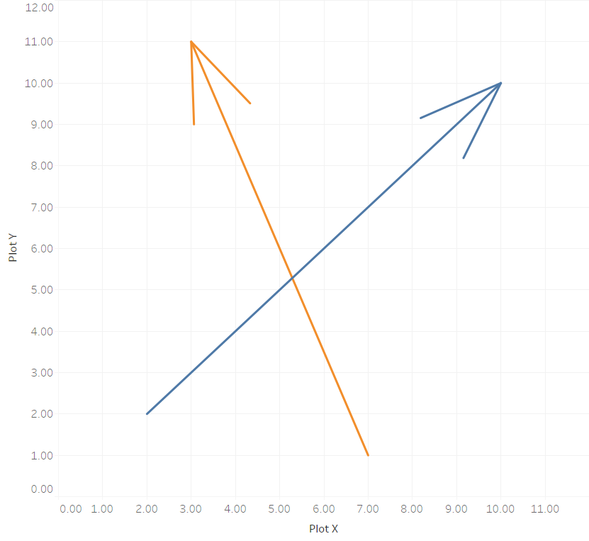
The task I was presented with was to embed the graphical output from an R package in a Tableau dashboard. Of course it’s possible to run R code from within Tableau Calculated fields, you can read more about it in official Tableau resources here, here, and here and also here on my blog. But part of the game is that there is only one vector of data being returned from the R session via Rserve into a Table Calculation in Tableau. So what about some of the complex graphics R can produce? Sure, you can try to rebuild those natively in Tableau based on the data returned from the code. But what if a) you’re too lazy to do that (and also it’s all just about rapid prototyping something anyways), or b) the visualization is just too complex (think 3D brain models)?

Continue reading →

Perfectly uniform arrows on a map in Tableau

Show me the Way: Putting Directed Arrows on Maps in Tableau

This is the continuation of a blog post I published a few weeks ago on how to draw directed arrows in Tableau. The approach introduced there – I dubbed it the “linear” approach, as instead of drawing one line we created two additional lines for the arrowheads – works fine on scatterplots, but things turn out to be a bit more difficult when working with maps. This article shows how these difficulties can be overcome using some on-the-fly reprojection of our data. While I claim the arrows to be my original idea (at least I didn’t find anything similar on the web – please correct me if I’m wrong!), I can’t and won’t take credit for this one. All original work was done by Alan Eldridge and the @mapsOverlord herself, Tableau’s Sarah Battersby in an article on hexbinning on Alan’s blog back in 2015. Sarah is an absolute expert on all things map projection, as she has shown time and time again in articles on the topic on the official Tableau and Tableau Public blogs and elsewhere (as in: real scientific publications).

Continue reading →

Directed arrows on a Tableau scatterplot

Giving your Flows a Direction in Tableau

In a recent blog post I showed how easy it is to create maps in Tableau showing paths, basically lines connecting two points each: the start and end locations. Those can be departure and arrival airports of certain flight routes, origin and destination of refugee flows, source and sink of money transfers, … the possibilities are endless!

But now imagine a map with a line connecting two locations A and B. Or rather many such lines. What information does this hold for you? What insights can you get out of such a viz? There is one very important element still missing! That is: which direction is this connection? Sure, there are cases where direction doesn’t matter, but thinking of the three aforementioned example use cases, many times it does! So let’s give our connecting paths some directionality. Let’s take simple lines and make them arrows!

Continue reading →

Using Coordinate Data in Degrees (DMS) Format in Tableau

Have you ever received a spatial data set that you wanted to visualize in Tableau, only to find out the coordinates looked like this: 50°07'01.9"N 8°40'20.8"E If so, or if you’re just generally interested in geographic data and Tableau, this post is for you.

Continue reading →

Population Lines - the Tableau Edition

Population Lines – the Tableau Edition

In 2013 Dr. James Cheshire from the Centre for Advanced Spatial Analysis at the University College London created a data visualization that was critically acclaimed back then and saw something of a renaissance a few weeks ago when a modified version by Henrik Lindberg made its way onto the Reddit front page. I had been mesmerized by the viz from the beginning, so when it reappeared in my blog reader I decided I had to try reproducing it in Tableau.

Continue reading →