Tableau Feature Important Toolbox as Tableau Prep flow

Feature Selection in Tableau

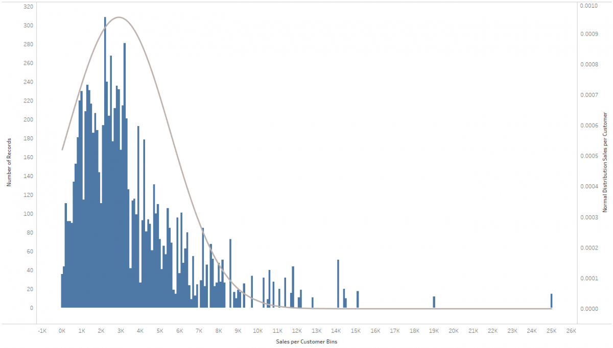
When trying to fit a machine learning model on a very wide data set, i.e. a data set with a large number of variables or features, it is advisable for a number of reasons to try to reduce the number of features:

  • The models become easier understandable, and their output as a result better interpretable, which leads ultimately to results that can be trusted rather than those of a complex black box model.
  • The exclusion of strongly correlated features can prevent model bias, as the effect of multiple variables could otherwise gain greater influence on the model as they actually do.
  • Similarly, it can help to avoid the curse of dimensionality, in the case of very sparse data.
  • Ultimately, the performance of the model can be optimized, as training times are shorter and the models are less computationally intensive.

While developing my talk “Machine Learning, Explainable AI, and Tableau”, that I presented together with Richard Tibbets at Tableau Conference in November 2019 in Las Vegas, I wrote a number of R scripts to perform feature selection and its preliminary tasks in Tableau. Due to the large number of questions I received about those scripts after the presentation, I decided to put together this article explaining what precisely I did there, in an attempt to make the “Tableau Feature Importance Toolbox” – as I’m calling the collection of scripts – available to the interested public. At a later point I will also summarize the contents of our talk in an article here on the blog, but for now you can find details about the scripts in the following, as well as the actual code files on my GitHub repository.

Continue reading →
A histogram with an overlaid bell curve

Jingle Bells – Adding a Normal Distribution to a Histogram in Tableau

It’s the holiday season, so why not amp you your vizzes’ holiday spirit by adding some bell curves to your histograms? Also, I just recently came across this request in a customer meeting and thereby discovered how easy that is to do. The most difficult part is wrapping your head around what a normal distribution is (please resort to Wikipedia for that), how it’s calculated (I literally stole the equation from Wikipedia) and how to translate that into a Calculated Field in Tableau. The rest is a simple dual-axis chart, a parameter and some rather basic Tableau techniques that need your attention.

Continue reading →

Perfectly uniform arrows on a map in Tableau

Show me the Way: Putting Directed Arrows on Maps in Tableau

This is the continuation of a blog post I published a few weeks ago on how to draw directed arrows in Tableau. The approach introduced there – I dubbed it the “linear” approach, as instead of drawing one line we created two additional lines for the arrowheads – works fine on scatterplots, but things turn out to be a bit more difficult when working with maps. This article shows how these difficulties can be overcome using some on-the-fly reprojection of our data. While I claim the arrows to be my original idea (at least I didn’t find anything similar on the web – please correct me if I’m wrong!), I can’t and won’t take credit for this one. All original work was done by Alan Eldridge and the @mapsOverlord herself, Tableau’s Sarah Battersby in an article on hexbinning on Alan’s blog back in 2015. Sarah is an absolute expert on all things map projection, as she has shown time and time again in articles on the topic on the official Tableau and Tableau Public blogs and elsewhere (as in: real scientific publications).

Continue reading →

Directed arrows on a Tableau scatterplot

Giving your Flows a Direction in Tableau

In a recent blog post I showed how easy it is to create maps in Tableau showing paths, basically lines connecting two points each: the start and end locations. Those can be departure and arrival airports of certain flight routes, origin and destination of refugee flows, source and sink of money transfers, … the possibilities are endless!

But now imagine a map with a line connecting two locations A and B. Or rather many such lines. What information does this hold for you? What insights can you get out of such a viz? There is one very important element still missing! That is: which direction is this connection? Sure, there are cases where direction doesn’t matter, but thinking of the three aforementioned example use cases, many times it does! So let’s give our connecting paths some directionality. Let’s take simple lines and make them arrows!

Continue reading →

Connecting the Dots – Visualizing Paths in Tableau

I had been planning to write this post for a long time. Not only have I been asked many times how to do this in my daily consulting work, but especially during and after my hands-on training “Stretching the Boundaries with Advanced Mapping” at our Tableau Conference On Tour 2017 in Berlin earlier this year. The question is pretty simple: How can I draw paths in Tableau? Oftentimes these are some kind of movement data, e.g. refugees or flight connections. The way to do this in Tableau is actually very easy – and some of the recently introduced features made it even easier – but it’s imperative to understand how Tableau draws lines and how the data therefore needs to be structured.

The OpenFlights.org route network visualized in Tableau

The OpenFlights.org route network visualized in Tableau

Continue reading →